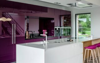
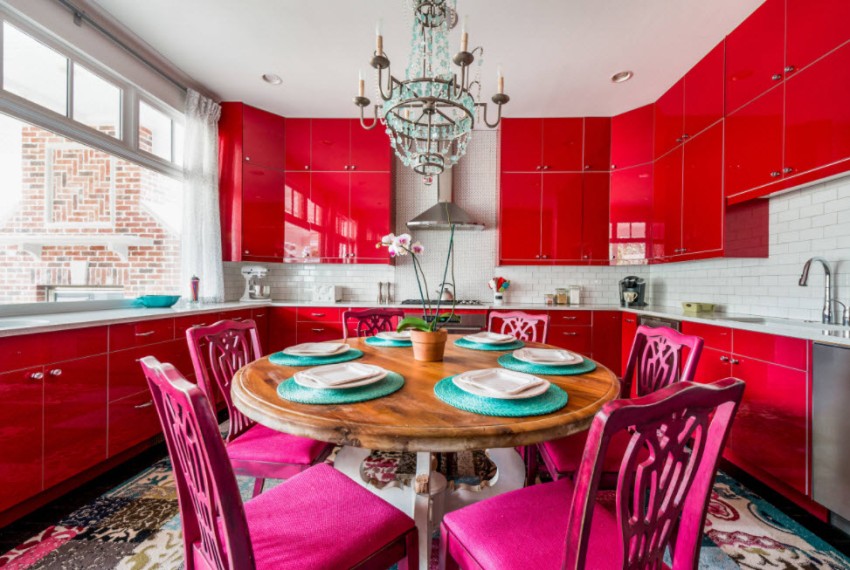
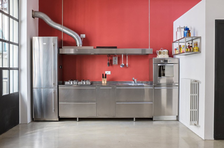
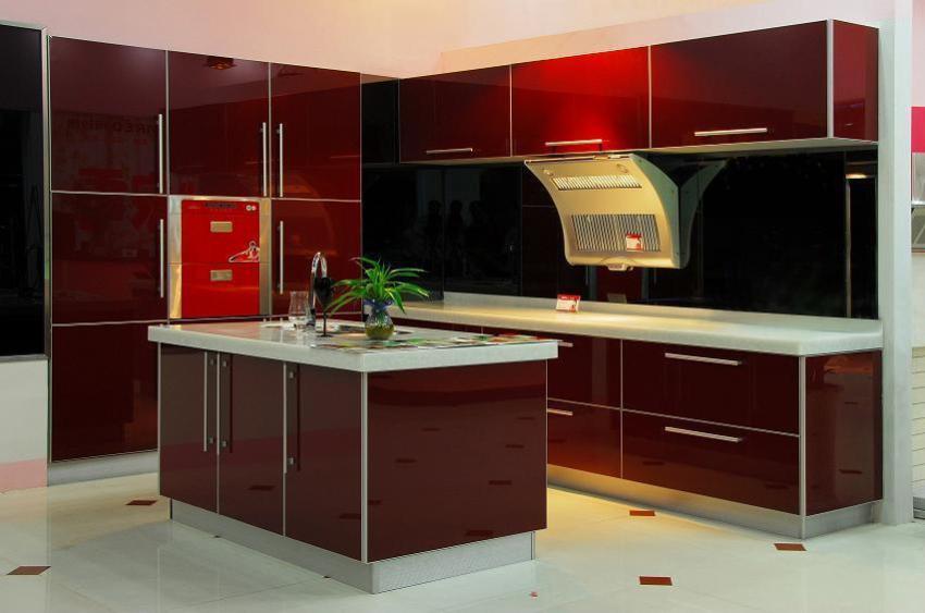
For a long time, red was used only to create bright accents, while it was never dominant in the room. Modern designers strive to experiment with the design of unusual interiors. The red kitchen is attractive, the room always looks elegant and beautiful. It is also important to take into account the certain influence of red on the emotional and physical state of people. Not everyone will like it.

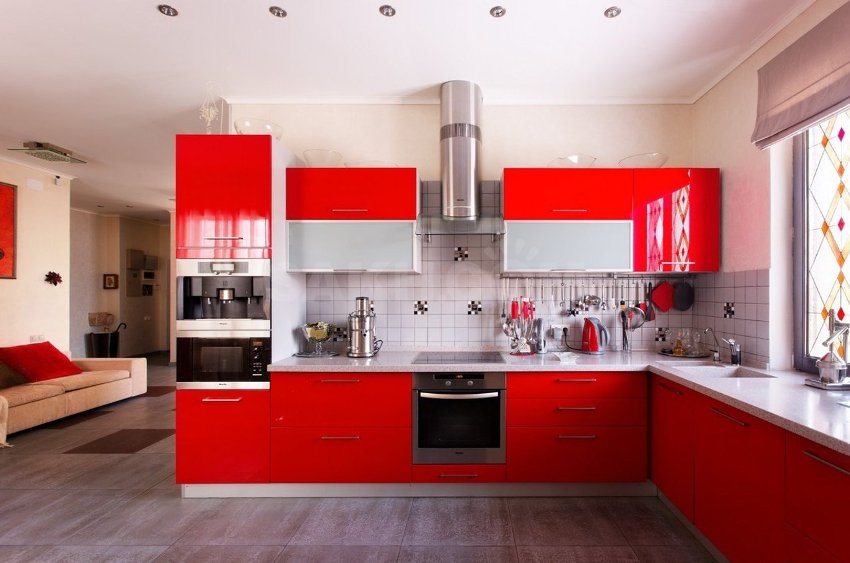
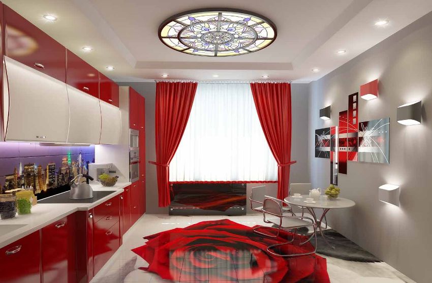
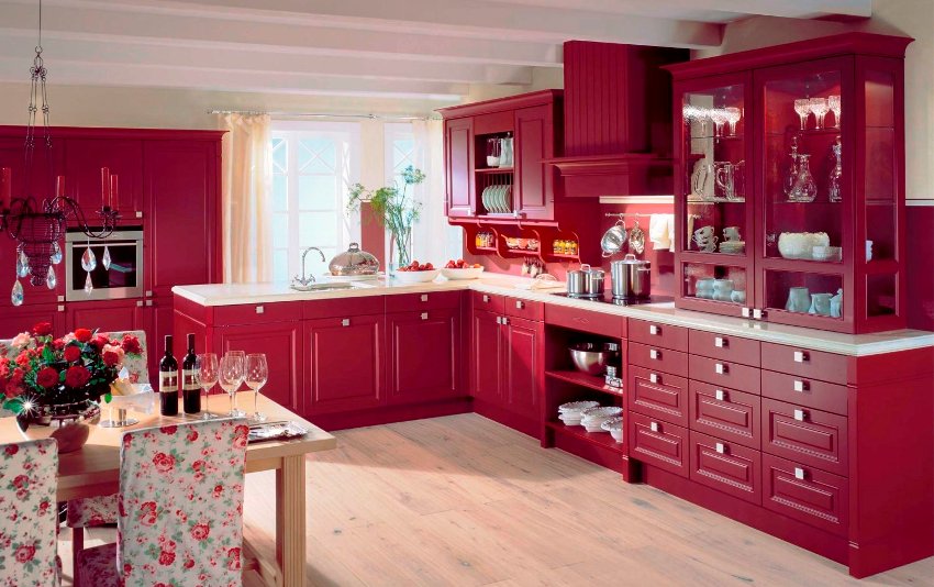
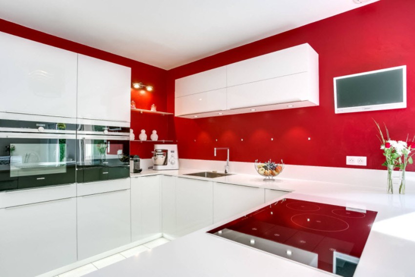
The interior of the kitchen in bright red is very extravagant
Content
- 1 How does red color affect a person in a kitchen interior?
- 2 Red kitchen: good options for interior decoration
- 3 Basic rules for choosing a headset for the kitchen in red
- 4 How to decorate an interior in a red kitchen: photos of successful interiors of small rooms
- 5 Design features of a large red kitchen: photos of attractive rooms
- 6 The main reasons why it is recommended to design a burgundy kitchen
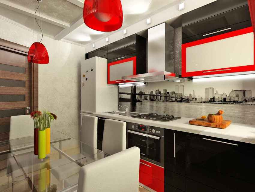
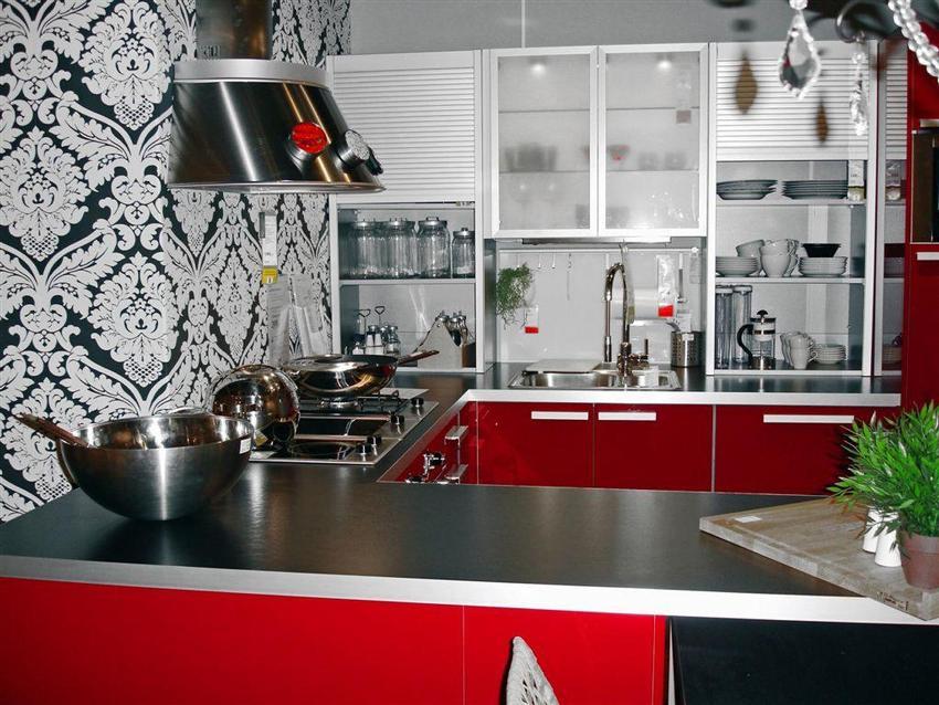
- 7 Extravagant red and black kitchen
- 8 Features of the design of the white-red and red-gray kitchen
How does red color affect a person in a kitchen interior?
Psychologists have long proven that each color in its own way affects the well-being and mood of people. Calm shades of neutral colors do not cause much emotion, while a red kitchen, especially if you overdo it with brightness and saturation of shades, can cause excessive excitement and even aggression. Therefore, you must always remember that when applying red, you need to be careful and careful, because it quite significantly affects the mood, expression of emotions and people's behavior.

Choosing a red kitchen, you should be careful and careful
The kitchen is considered one of the most visited rooms in which all residents of an apartment or house spend the most time. Therefore, it is good if the design of an unusual kitchen creates an upbeat and creative mood that contributes to the preparation of new and interesting dishes. If the red color in the kitchen is used in dosage, then it will not cause discomfort or any negative emotions. Thus, a red kitchen in the interior, on the contrary, will have a positive effect on the efficiency and increased appetite of those present in the room.
It is interesting! The most delicious dishes and products are red, for this reason, the red shades in the interior make the taste buds work more actively. Food served on red dishes seems juicier and tastier to a person.

Red color stimulates some biological processes in the human body
In addition to the fact that red color in the interior has a positive effect on human mental activity, kitchens in this design have a more hospitable and cozy look.If you correctly dose the amount of color, you will be able to visually expand the boundaries of the room. Negative points of using red:
- With a prolonged stay in the kitchen, made in red, quick fatigue and irritability are possible.
- If bright scarlet shades were chosen, there is a possibility of symptoms of psychological stress and irritability.
- People with hypertension may experience upward pressure surges.
- The use of only red pieces of furniture makes the situation heavier and hides the space.

For those who sometimes like to limit themselves in food, go on diets, red is not quite suitable for decorating the kitchen
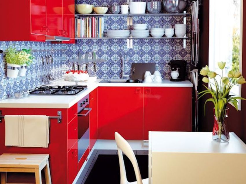
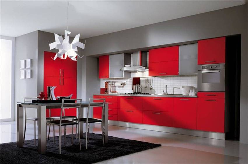
Red kitchen: good options for interior decoration
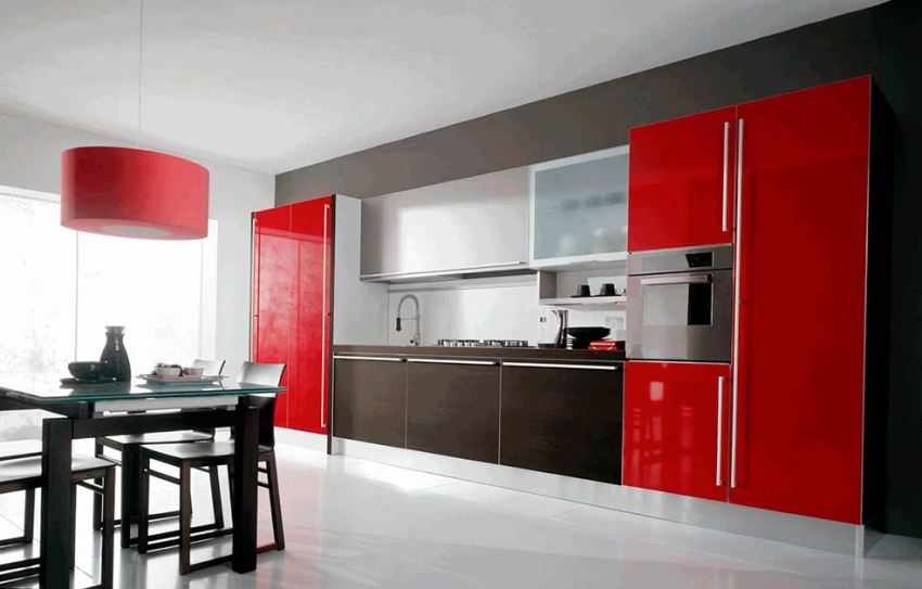
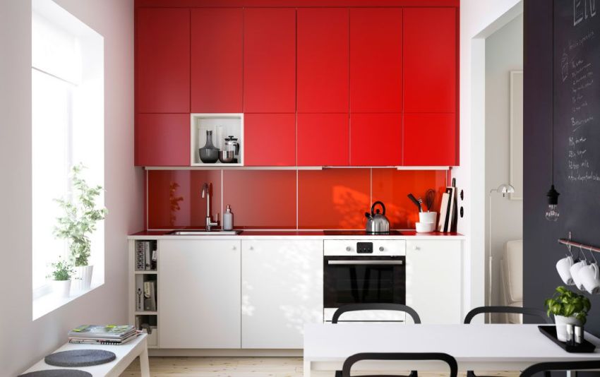
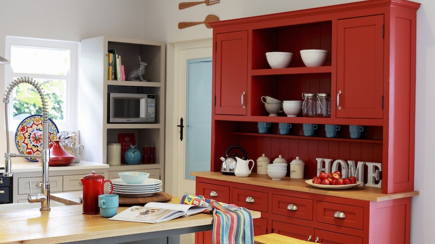
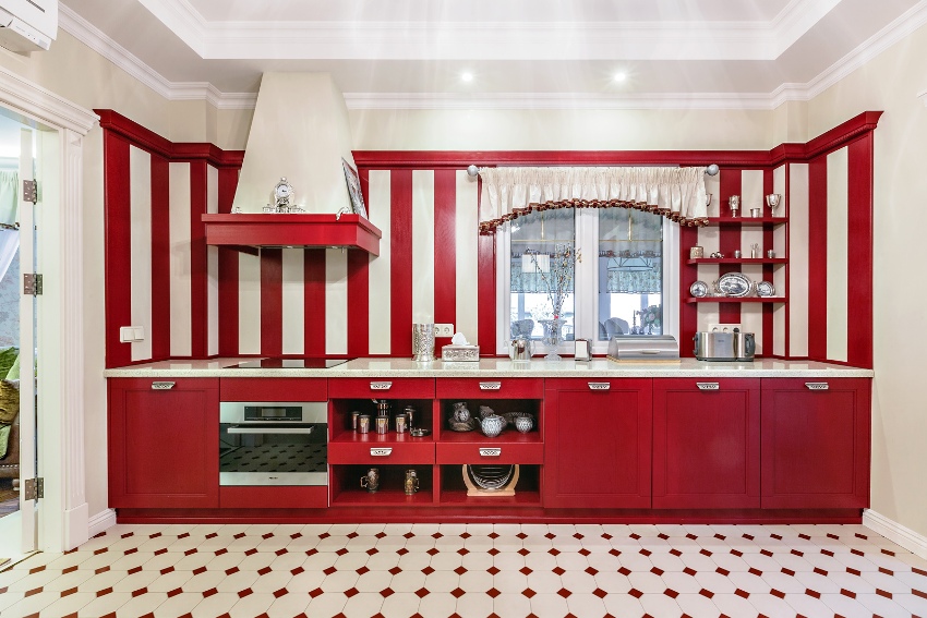
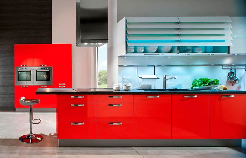
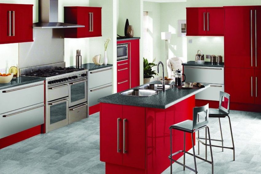
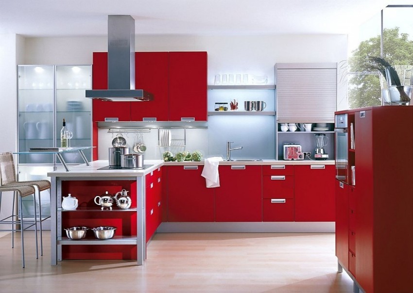
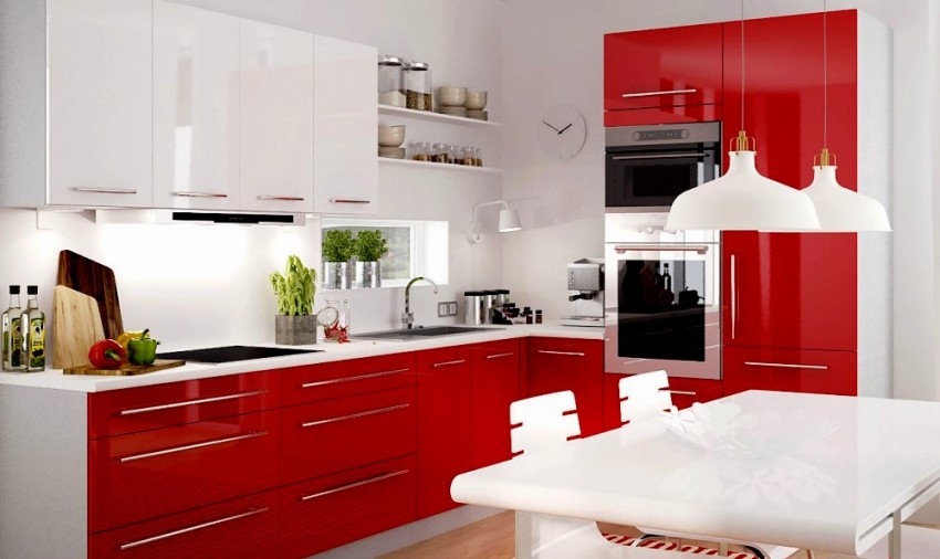
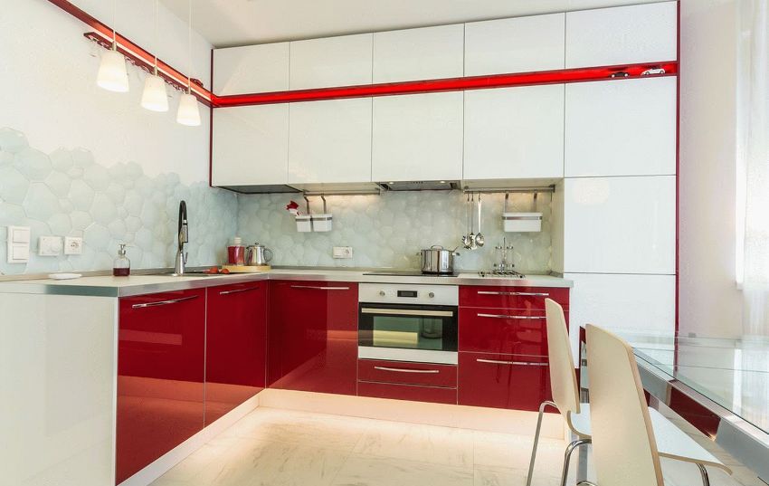
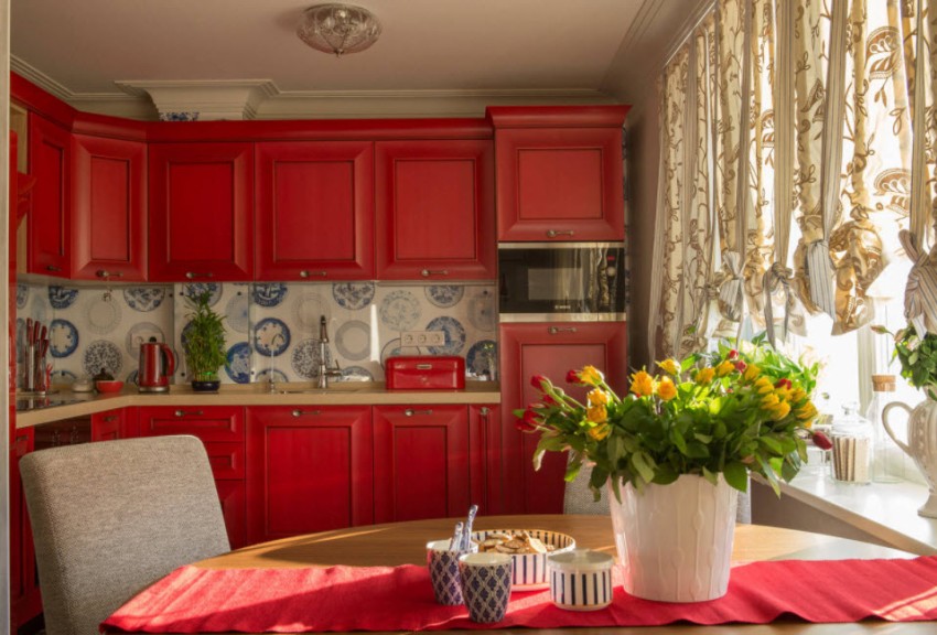
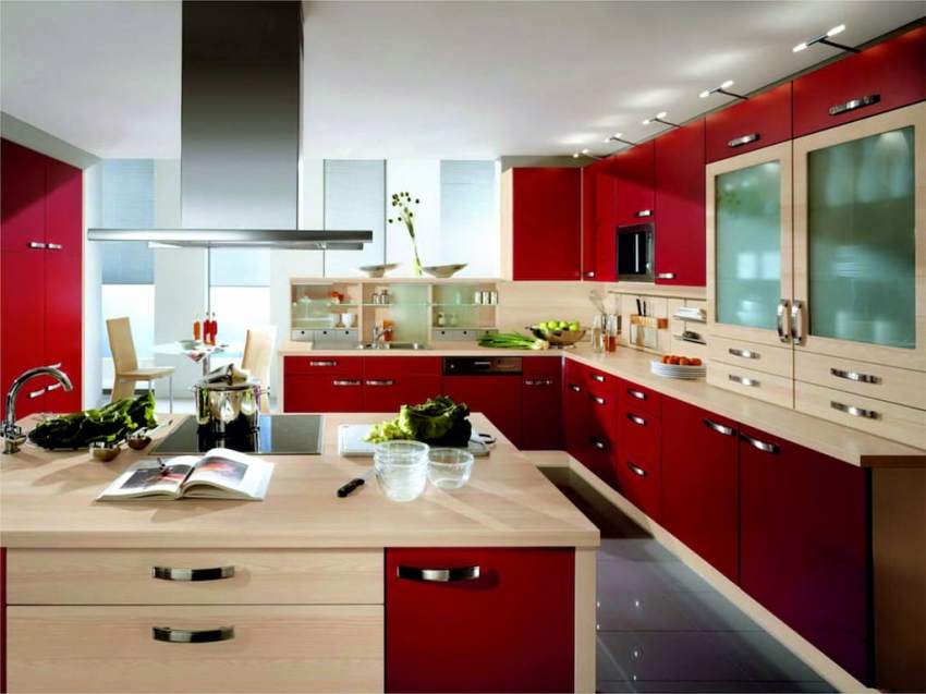
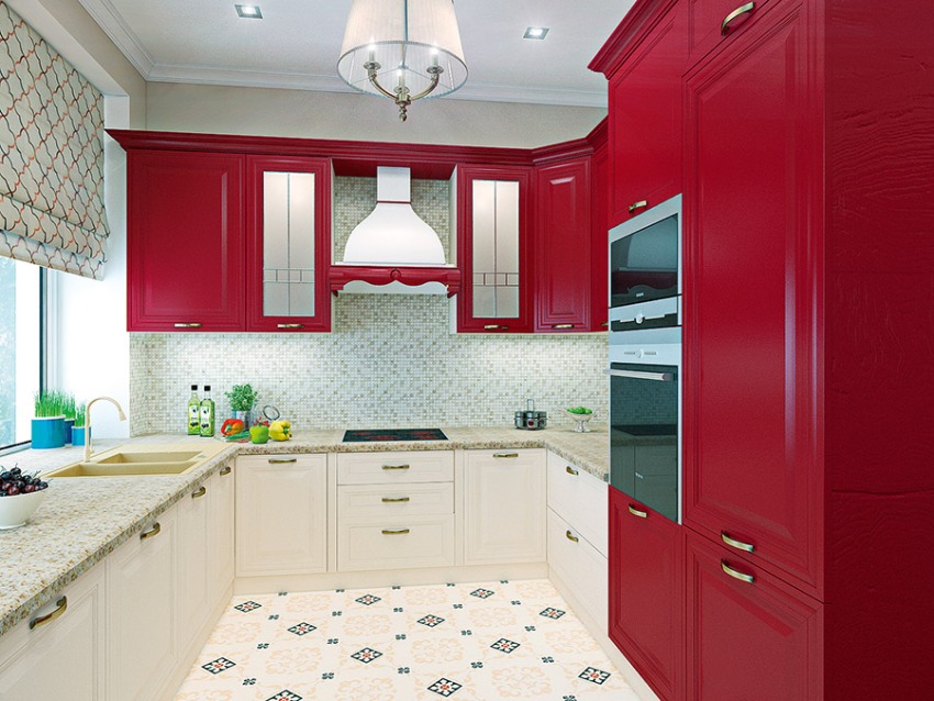
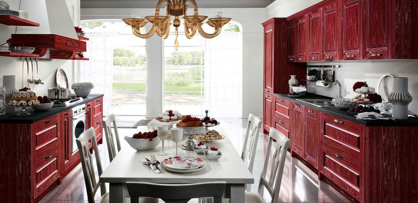
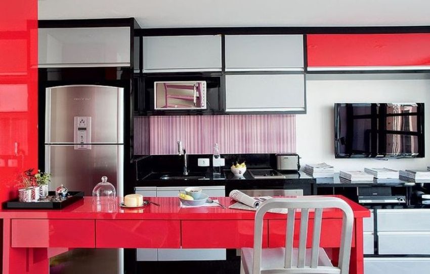
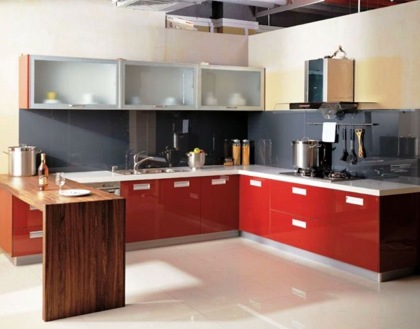
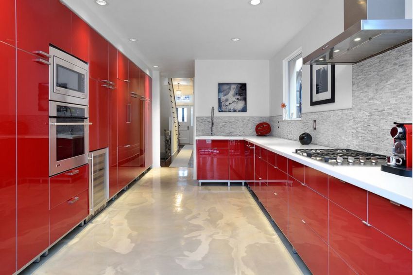
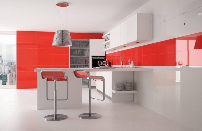
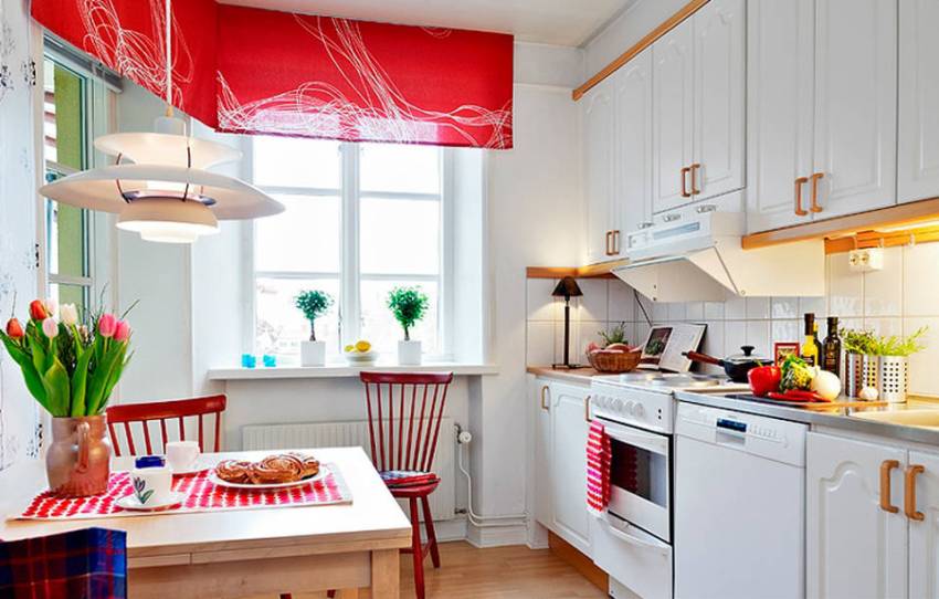
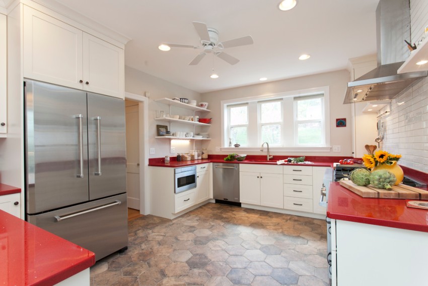
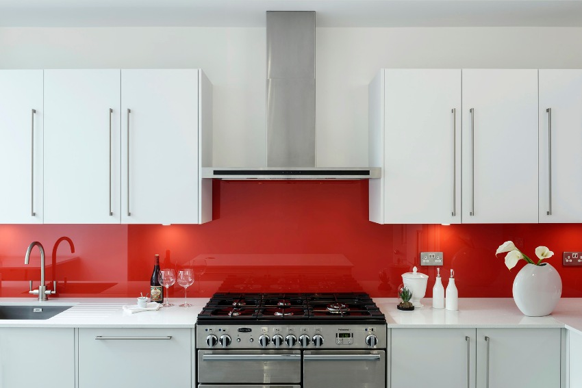
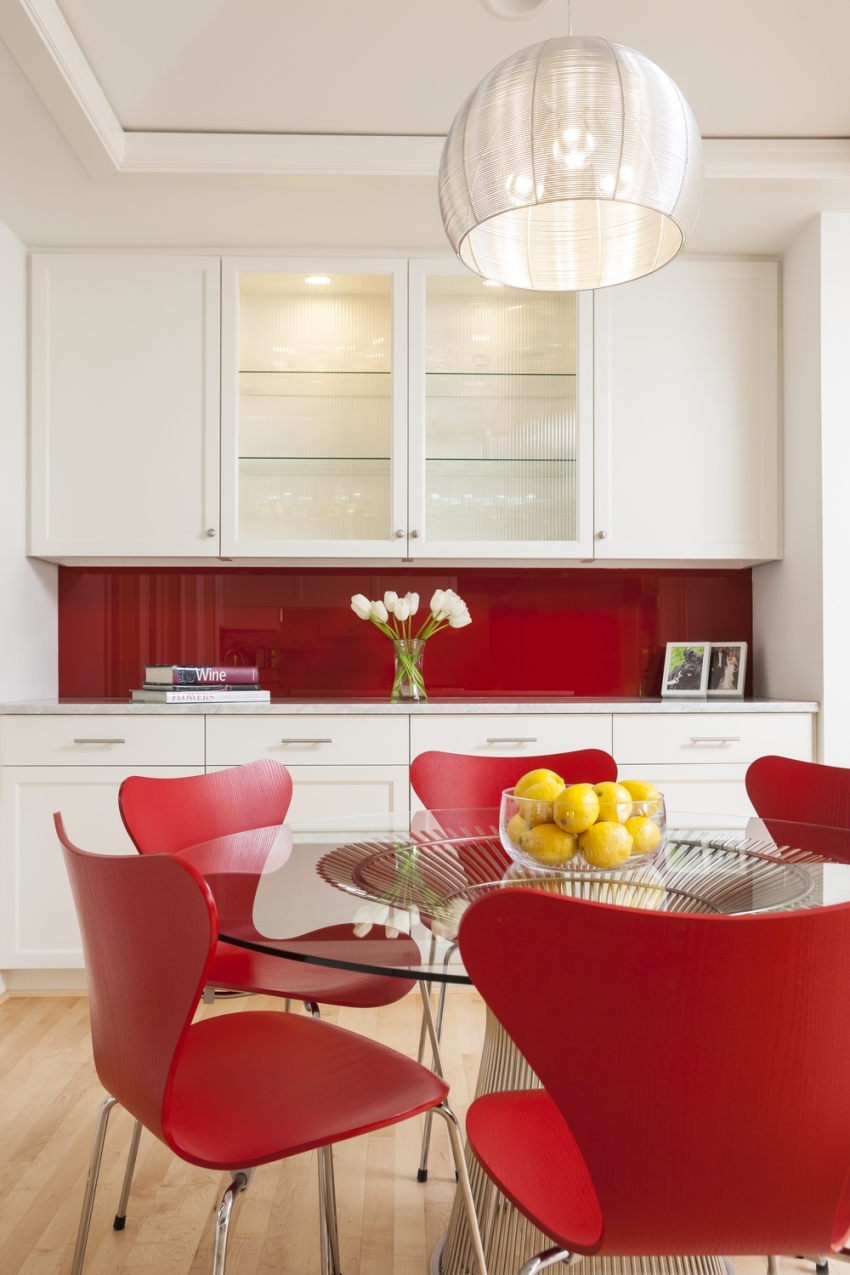
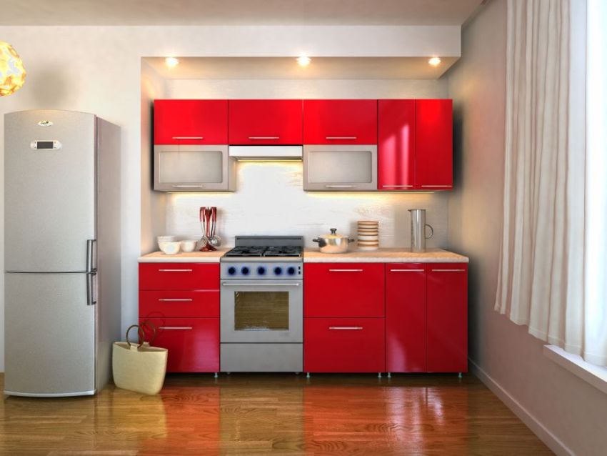
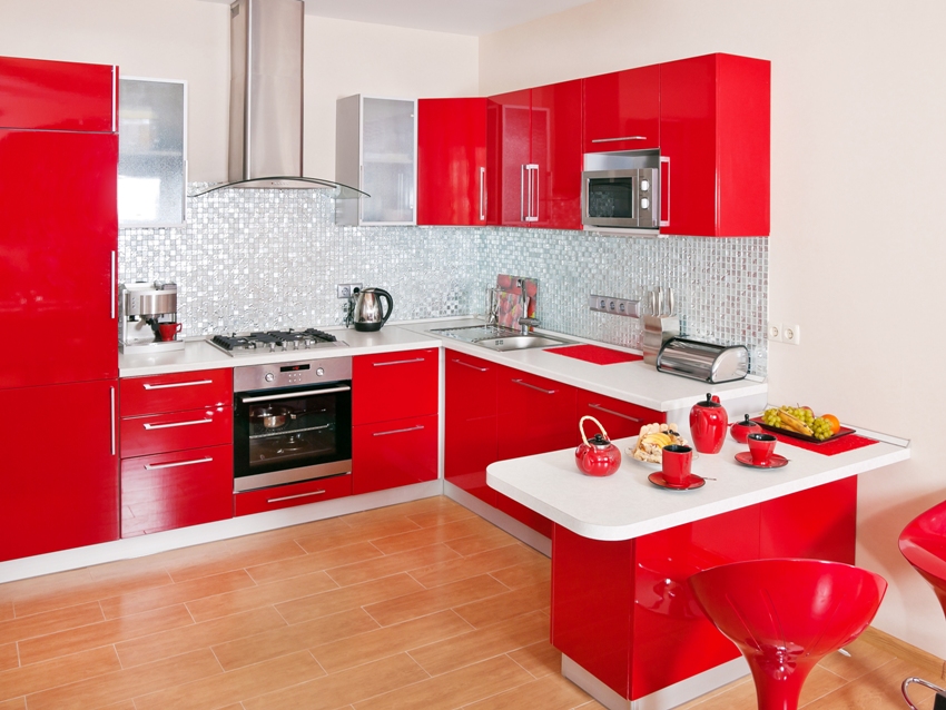
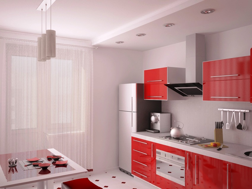
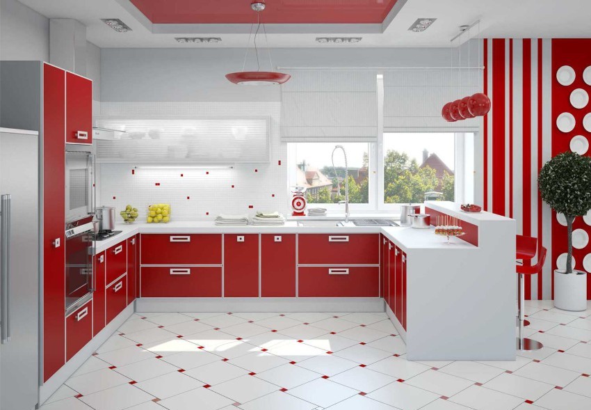
If you look at a selection of photos of kitchens in red, then you can notice that only red is never used for surface finishing, because the oversaturation of this color in the room will quickly tire those present. For this reason, it is recommended to reduce the number of reds and dilute them with other, calmer tones. So, for a long time, kitchen designs in red and white tones, which look attractive in conditions of various areas, do not lose their relevance.

To decorate the interior of the kitchen in red, it is better to choose soft warm tones of red
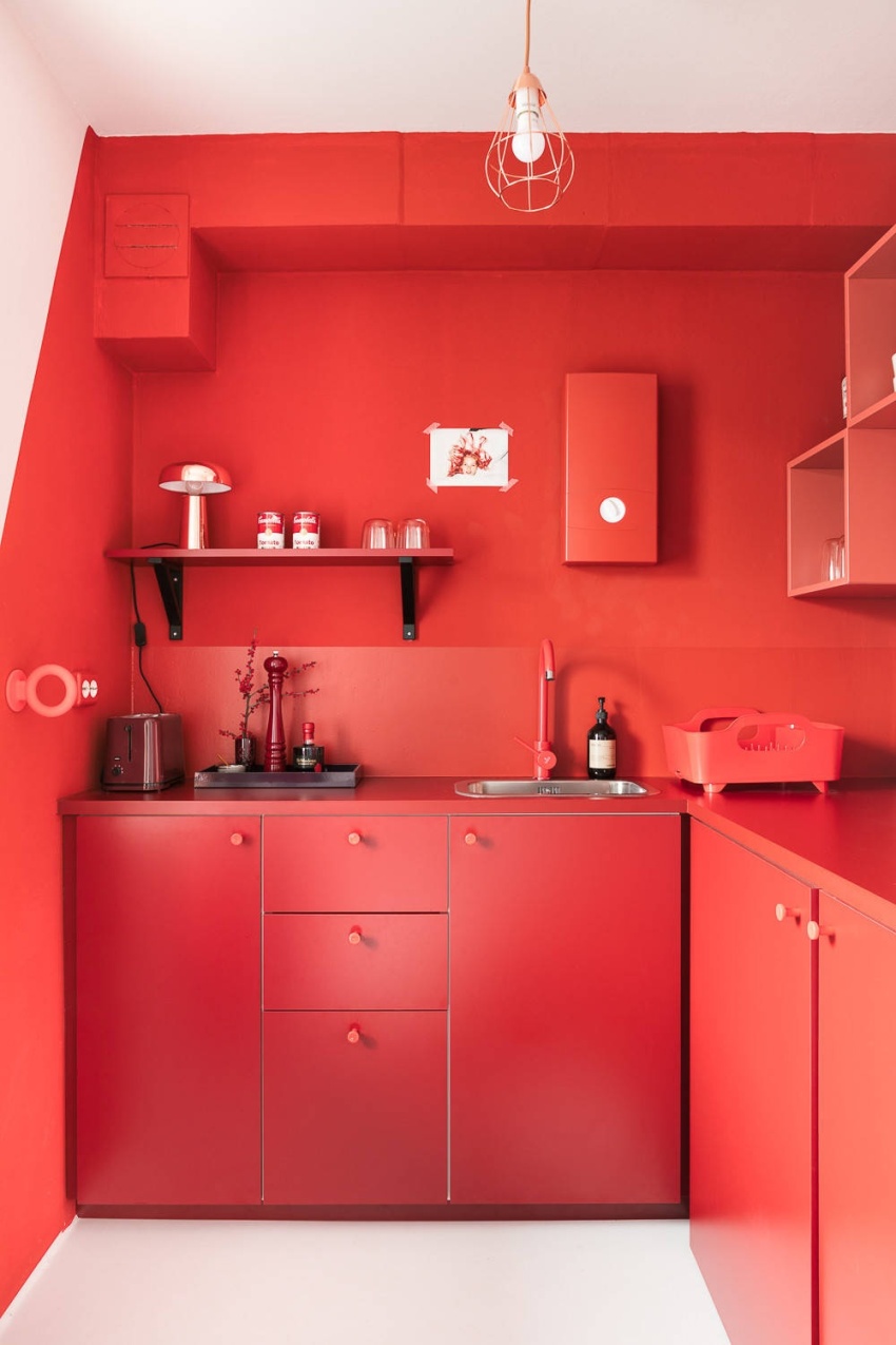
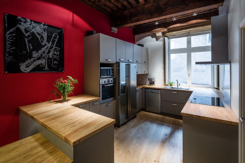
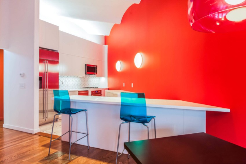
If you want to use red wallpaper in the kitchen, then you should not use it on all walls at once. It is enough to make one or two bright accent walls, and against their background it is appropriate to install a kitchen set of a light shade. It should also be borne in mind that if all walls are made in red, visually the space will significantly lose in volume, and the presence of a red ceiling will significantly reduce the height of the kitchen.
Designers recommend making the ceiling as close to white as possible, because in this case, the height of the ceilings, on the contrary, will visually increase. To expand the common space, several walls are recommended to be made in light shades. The colors that go best with red include:
- white;

Red gives the room a character
- beige;
- the black;
- gray and silver;
- beige and milky;
- metallic.

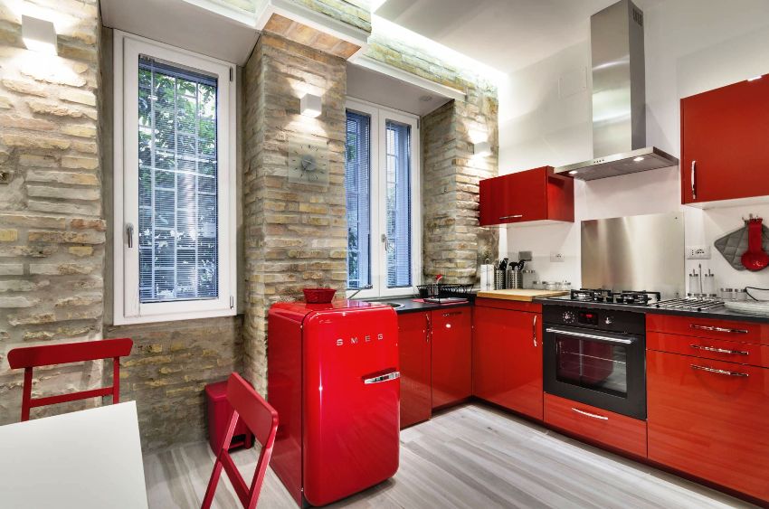
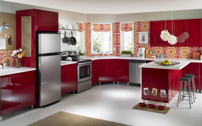
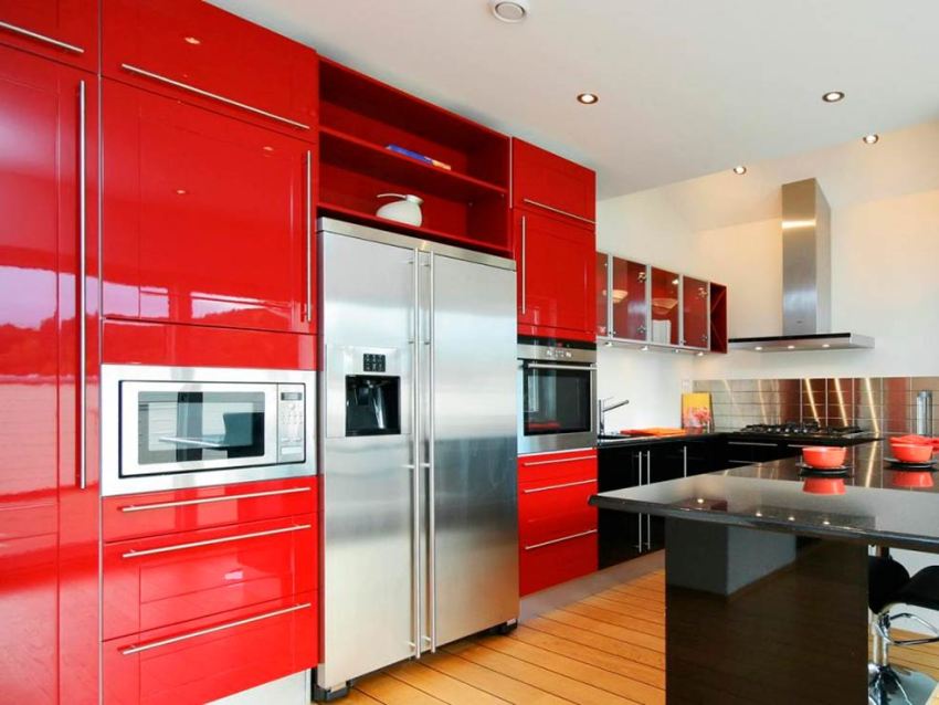
An excellent solution is a red refrigerator, which is a bright art object in any kitchen.
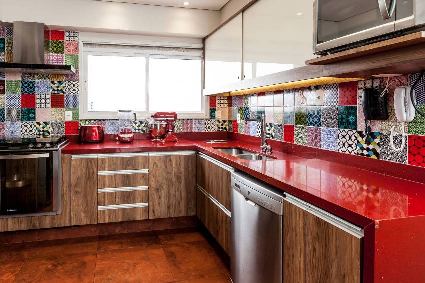
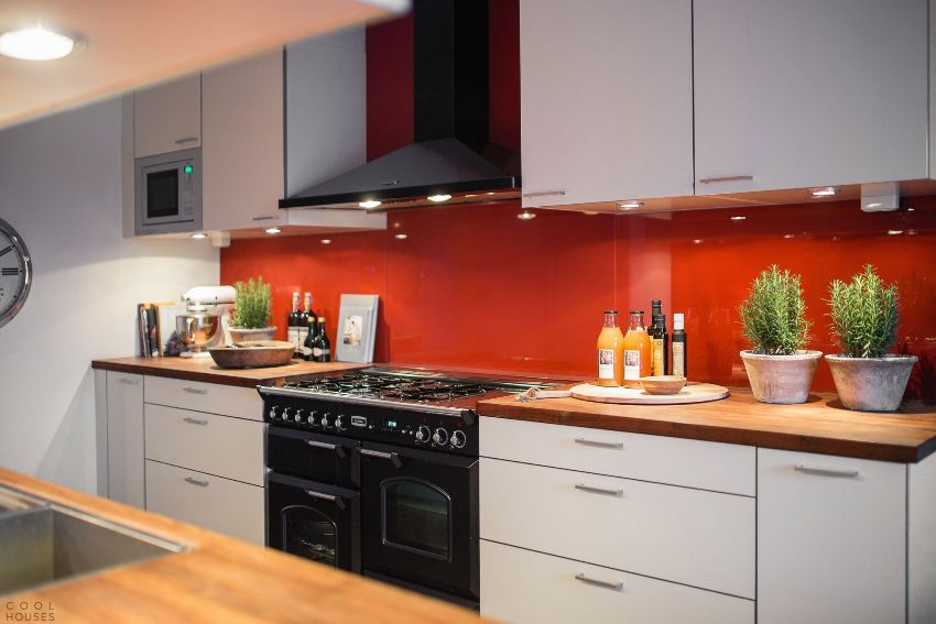
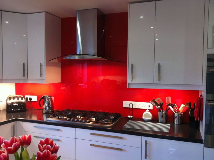
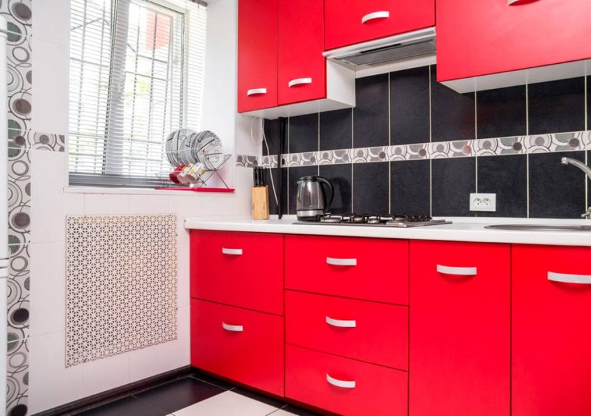
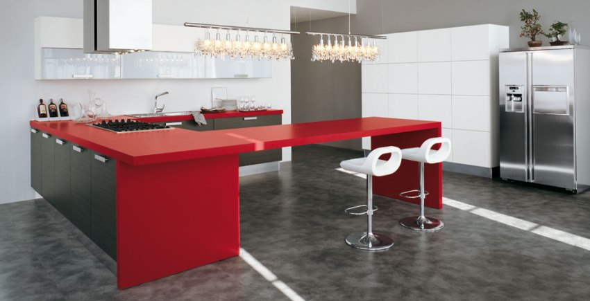
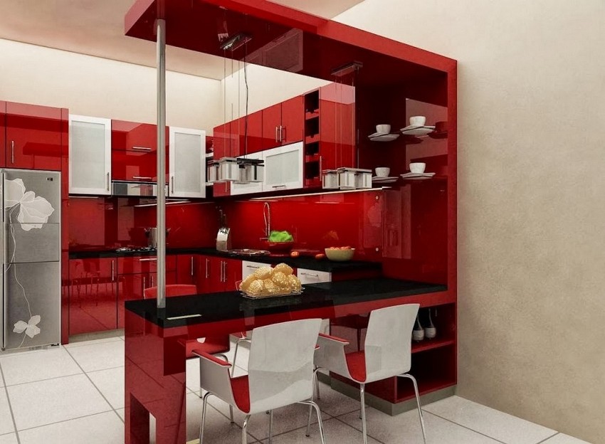
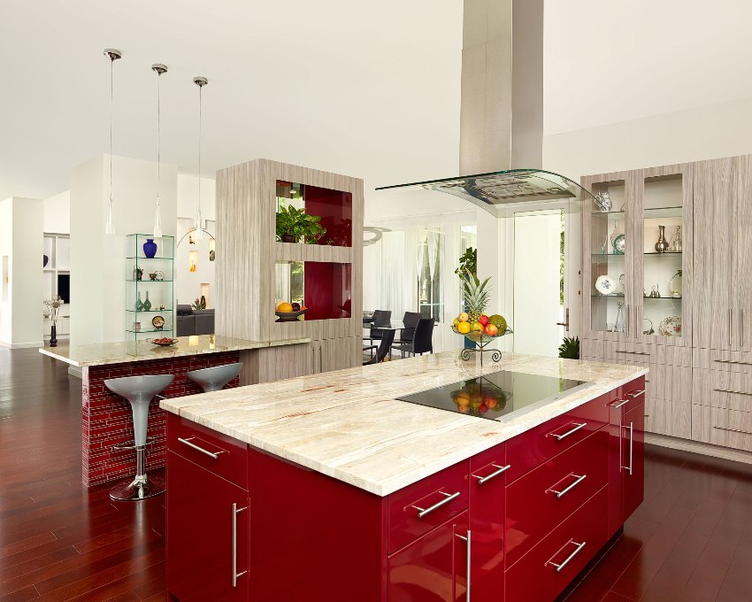
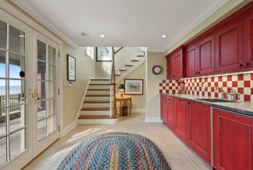
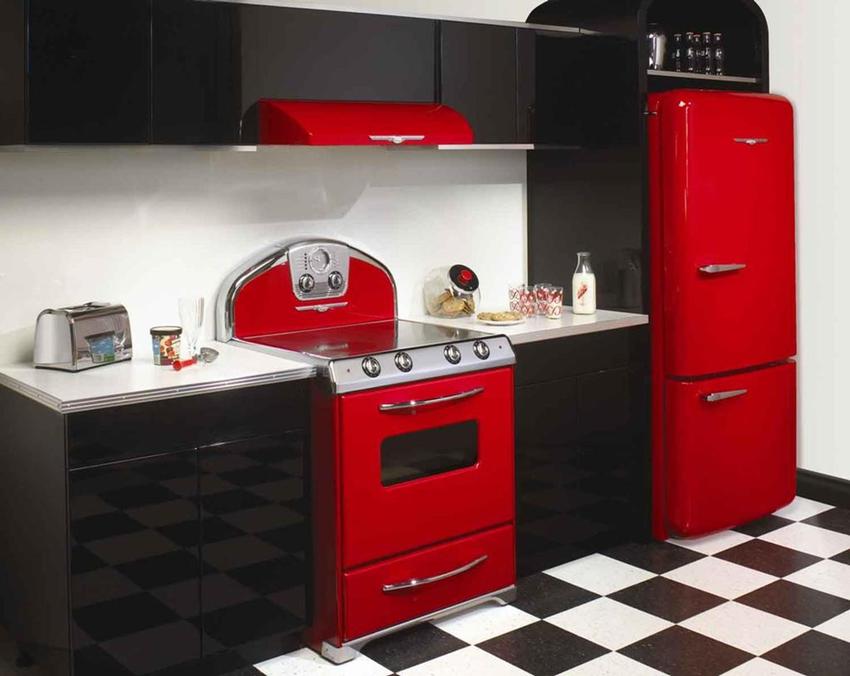
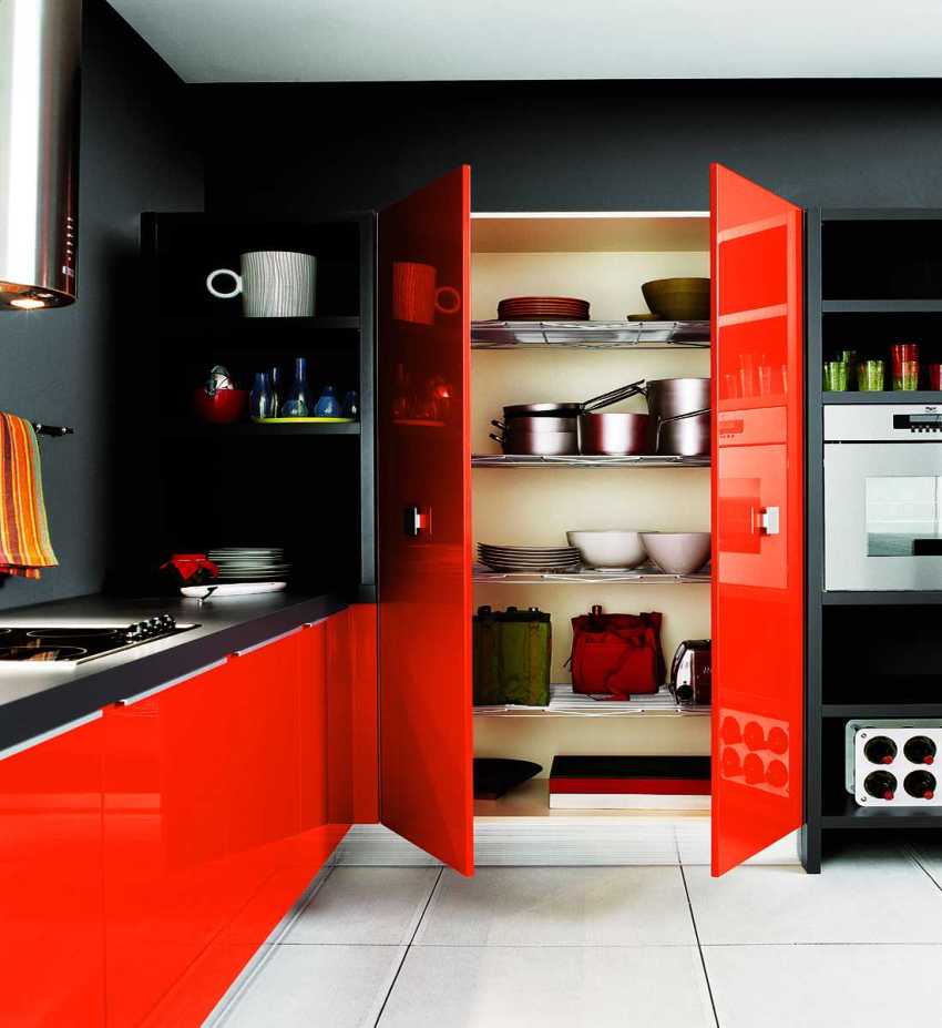
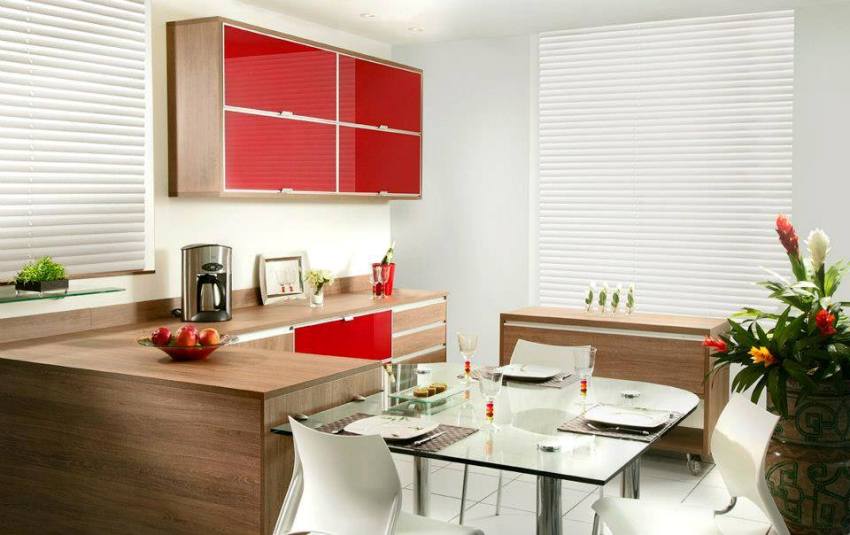
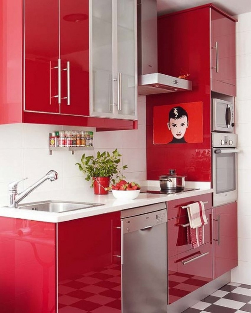
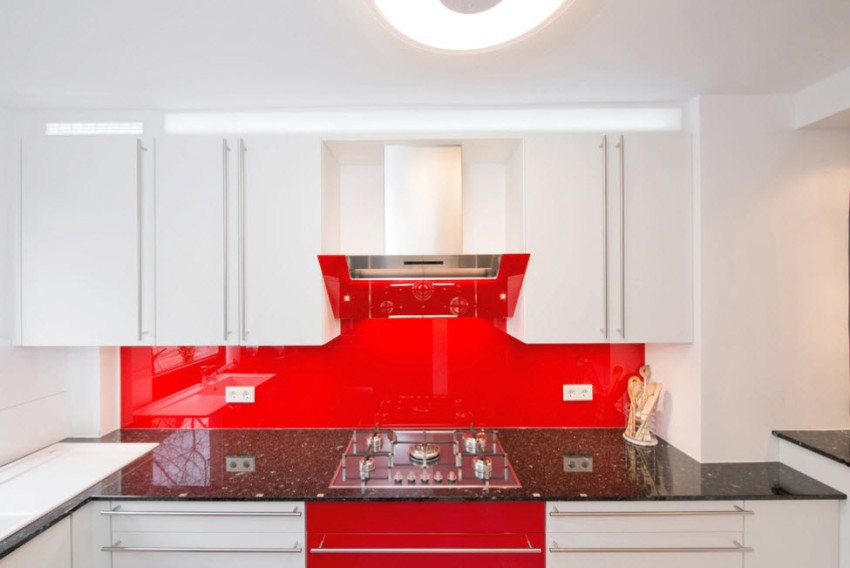
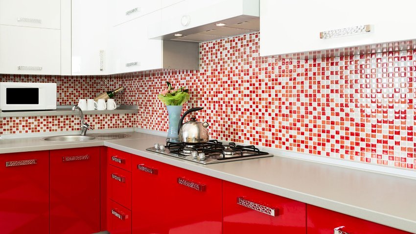
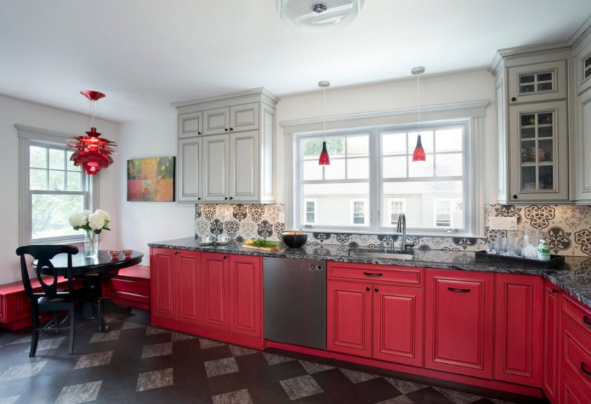
The kitchen design in red suggests various finishes, which provide for the highlighting of one of the neutral light shades against the red background. So, it is appropriate to make a red backsplash for the kitchen, laid out with ceramic tiles. It can be continued with red flooring. Among the photos of kitchen interiors in red, there are often options when the floor will be combined. For example, checkerboard flooring with equal-sized red and white tiles looks great.

Red furniture on a white background will look especially impressive
Basic rules for choosing a headset for the kitchen in red
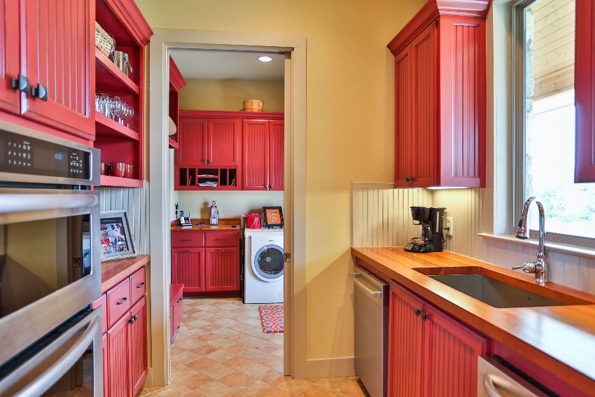
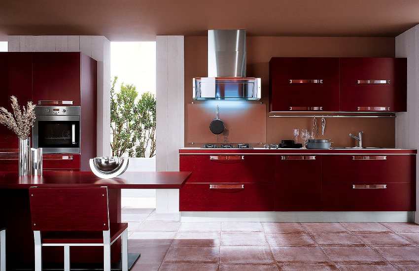
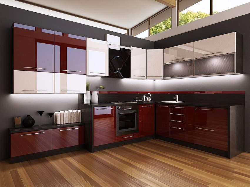
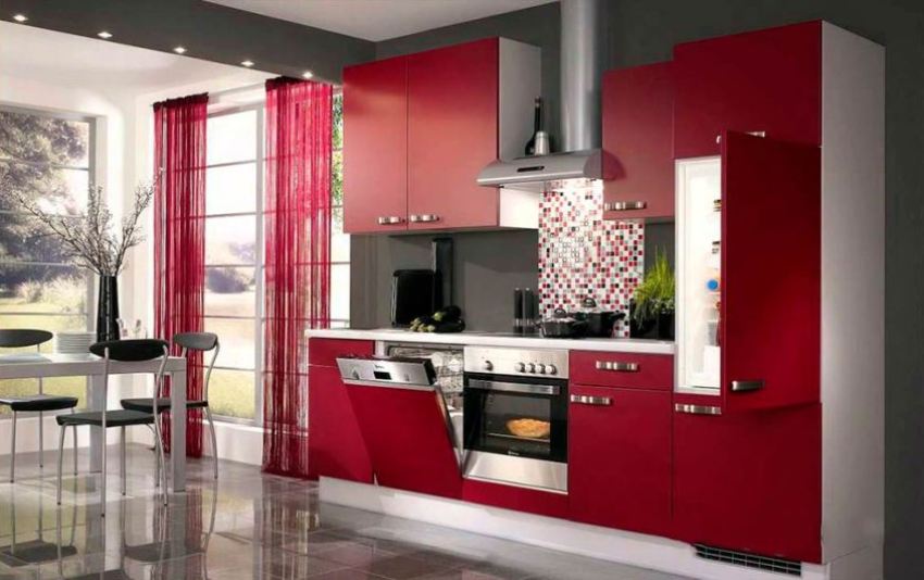
Modern manufacturers offer a wide selection of kitchen sets in red. For their production, various materials are used that determine the price of the finished product. The most budgetary option is considered to be furniture made of chipboard using laminated surfaces. Furniture items made of MDF or natural wood are considered more expensive, but environmentally friendly.

Too much red, even in a very spacious room, can be tiring, uncomfortable and irritating
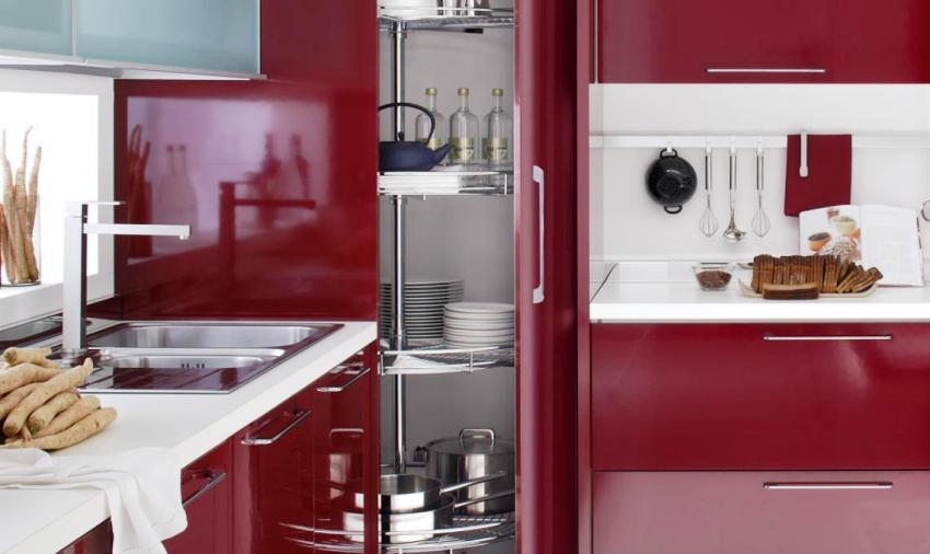
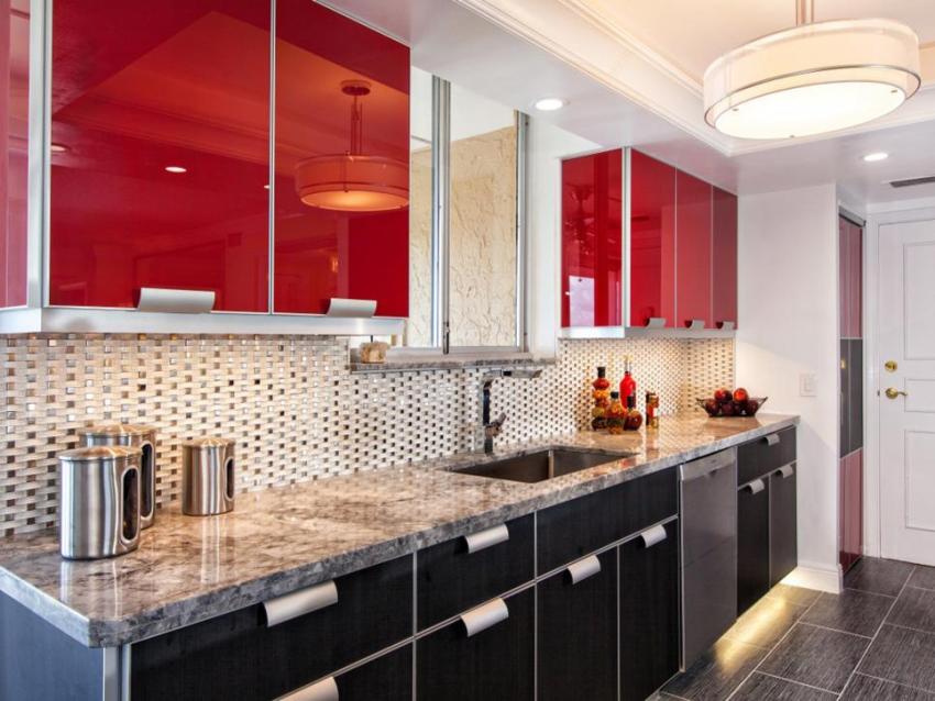
Considering the photo of red kitchens, you can most often notice that basically only the facades of the kitchen set are decorated in this color design, while other components of the furniture differ in other shades.Depending on the budget allocated for the renovation of the kitchen, you can choose facades covered with plastic, veneer, melamine, enamel or ordinary varnished coating.
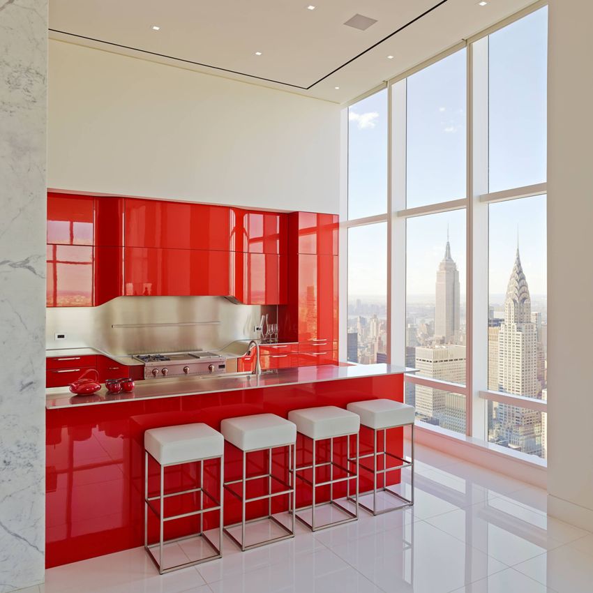
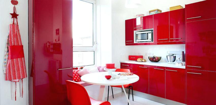
The design of the kitchen in red looks very beautiful with the glossy facades of the headset. In addition, it is appropriate to decorate surfaces using photo printing. It is important to use images of fruits or bright colors in kitchens.

By correctly dosing the amount of red, it will be possible to visually expand the boundaries of the kitchen
Useful advice! If you correctly combine shades, then the red kitchen set is easy to fit into both a spacious kitchen and a small room.
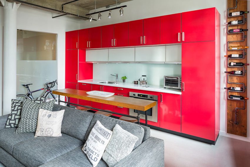
Of course, red looks more profitable in studio kitchens or in spacious rooms, where objects made in this tone can be made the main accent element of the space. In a small kitchen, the best option is to combine red with other colors such as white, gray, brown and beige in a headset. Additionally, you can decorate the facades with glass inserts fixed in a metal frame. The style of furniture is chosen based on the general concept of organizing the space.
Related article:
Black and white kitchen: the concept of Yin and Yang in the interior
Recommendations for choosing furniture, creating designs and decorating in different styles. Tips and photos of examples of design.
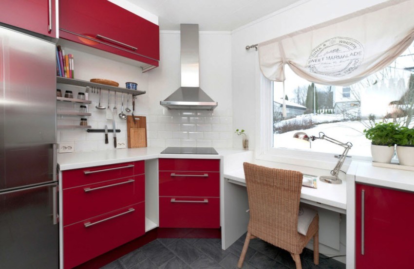
How to decorate an interior in a red kitchen: photos of successful interiors of small rooms
It is considered a bold decision to design a red kitchen in a small room, because the abundance of red in a small room can most actively affect a person. Therefore, designers recommend adhering to the basic rule of arranging a small kitchen - do not use many bright elements.

The use of a rich red color in the interior of the kitchen visually reduces the room
A small kitchen decorated with bright red tones does not provide an opportunity to relax, on the contrary, it can increase tension. Also, do not forget that red is conducive to improving appetite. In this regard, people who are prone to overweight should not give preference to this color in the kitchen, because this will further complicate the task of weight control.
Red itself is considered a "hot" color. Therefore, if the kitchen windows face south, it is better to use it minimally. It is recommended to give preference to other cold shades.

The main conclusion that suggests itself after viewing photos of designs of small red kitchens: red in a small kitchen should be diluted as much as possible and combined with other tones, or leave red only to create bright accent details. You can also use not flashy shades of red, but softer ones. For example, a scarlet or cherry-colored kitchen looks good.
Scarlet, although considered bright, belongs to light colors, making the room seem more spacious. Cherry is considered to be the warmest and most neutral shade of red, which fills the room with coziness. It should be borne in mind that if this color is used for wall decoration, then the space will seem narrower.

In the interior of a small kitchen, it is better to use red only as accents that will not overload the space.
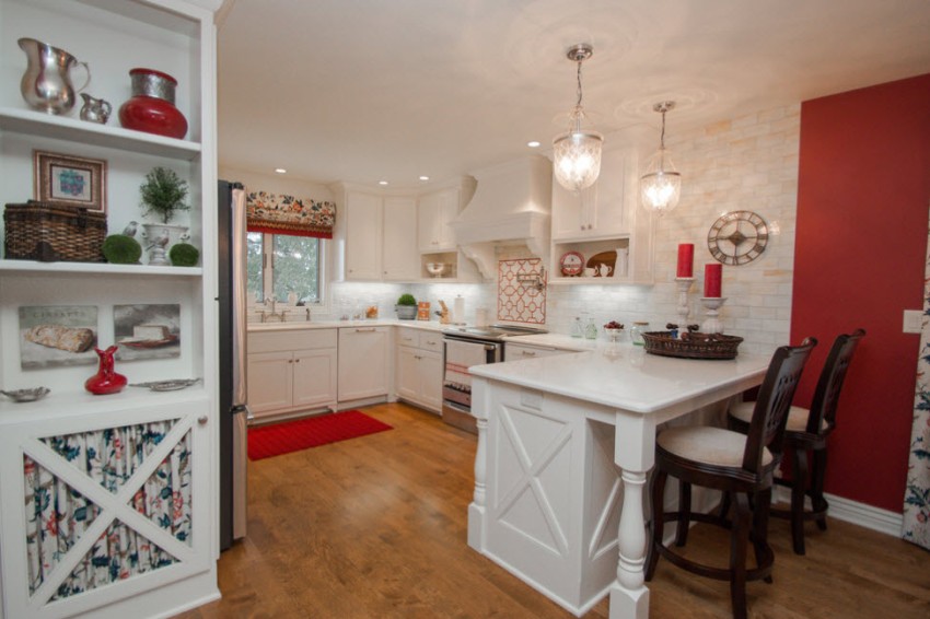
In a small room, the main principle must be observed - to place accents correctly. It is appropriate to make one wall red, and against its background to fix a snow-white kitchen set. In the photo, red and white kitchens always look light and beautiful. If you choose a not very bright shade of red, then even if you paint a wall with a large area with it, it will not irritate and hurt your eyes.
It is better to refuse a red headset in a small kitchen, because you can oversaturate the room with bright.A good way to decorate a room is to purchase red curtains for the kitchen, a bright chandelier or small decorative items. In this case, the interior will not negatively affect the psychological state of a person.

If the wall decoration has a neutral color, then a red kitchen set is quite acceptable.
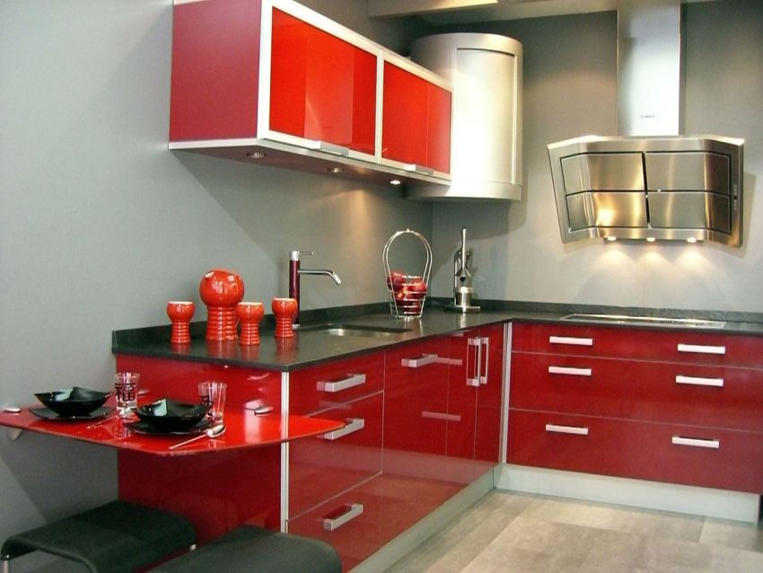
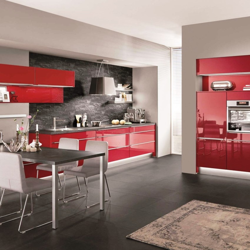
Design features of a large red kitchen: photos of attractive rooms
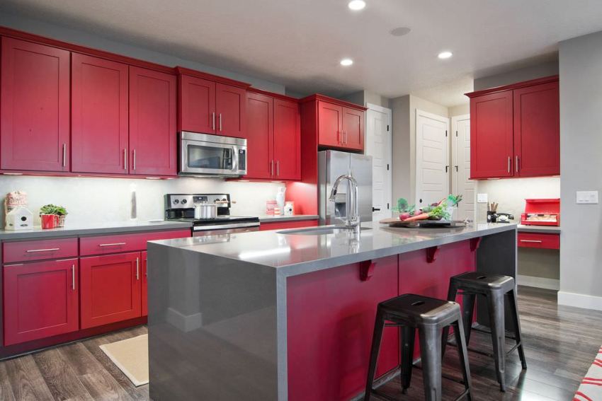
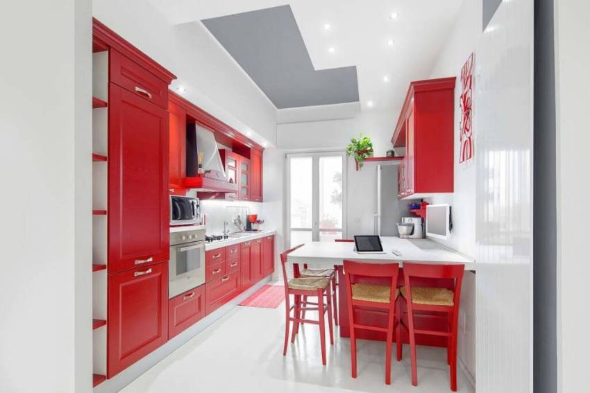
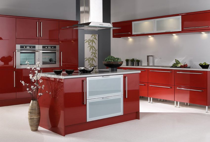
Looking through the drawings of large kitchens, you can notice that in this case, the red set is very useful. Moreover, in a spacious kitchen, it is appropriate to use both bright shades of red and neutral ones, because in this case there is enough space and space to dilute the intense interior, using lighter colors.
In a kitchen with a significant area, it is permissible not to use light shades, since in a spacious room you do not need to work on the visual expansion of the room. Therefore, both light and dark shades are allowed for wall and ceiling decoration.
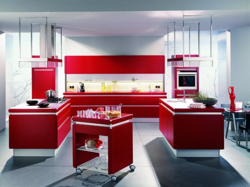

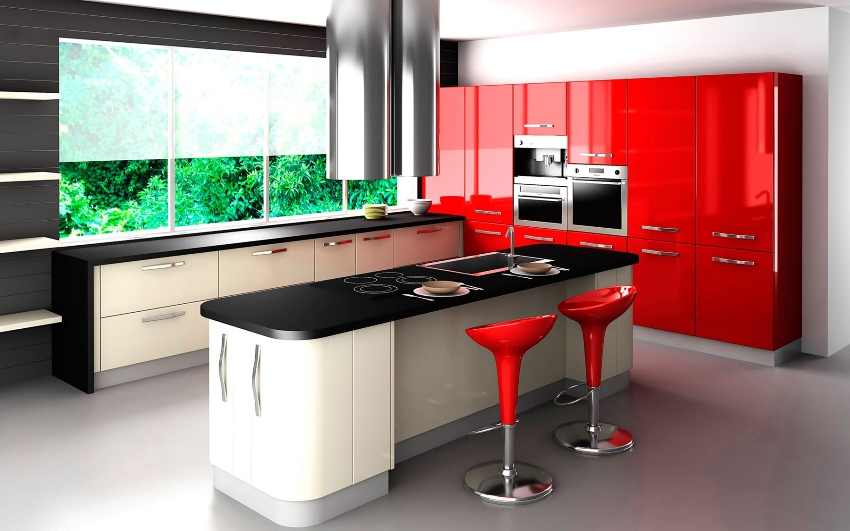
When decorating the design of a large red kitchen, you can experiment with the color of household appliances, which can be chosen not only in white, but also in red, especially since the size of the room allows you to arrange a large number of necessary items. In addition to the red ones, silver facades of equipment will also look good in this interior. So that everything in the interior is harmoniously combined, one of the walls can be made in a light gray color.
Wallpaper of a dark color is ideal for a red kitchen. Despite the fact that they will visually reduce the area, the dark shade of the walls will make the emotional interior softer and more neutral.

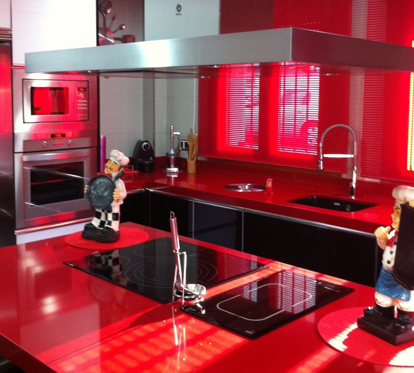
The scarlet scale is so active that this color should not be used as a background and dominant even in very large rooms.
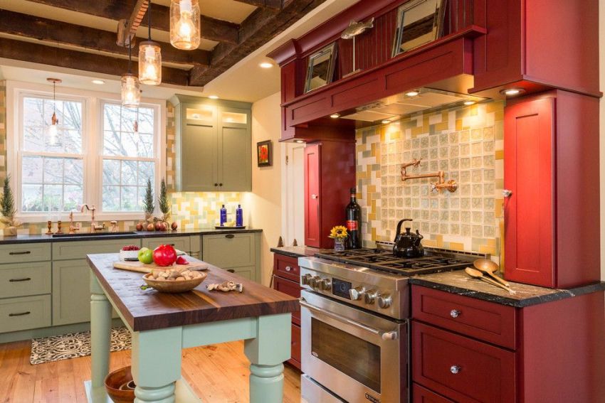
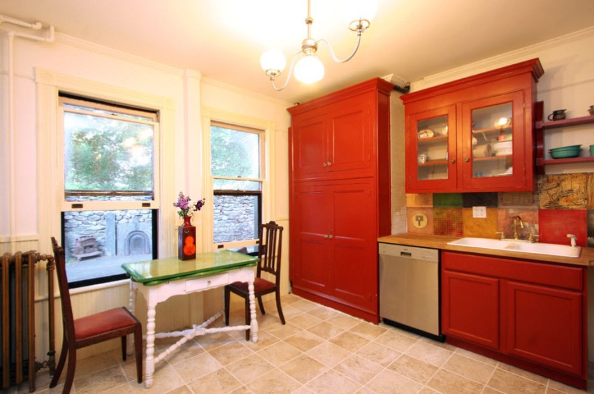
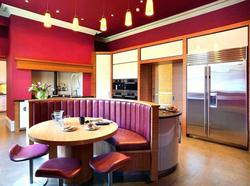
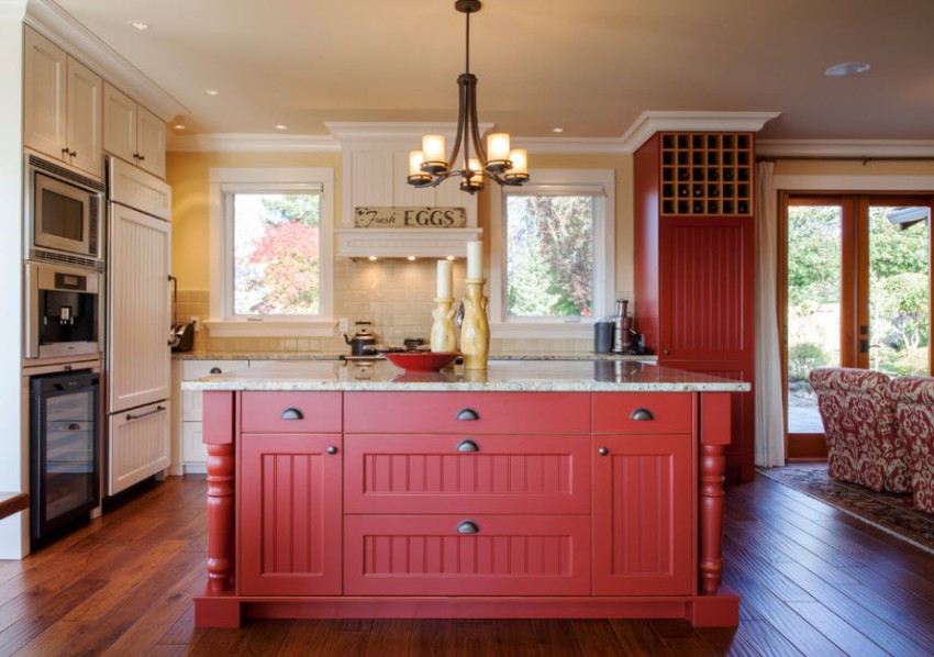
The main reasons why it is recommended to design a burgundy kitchen
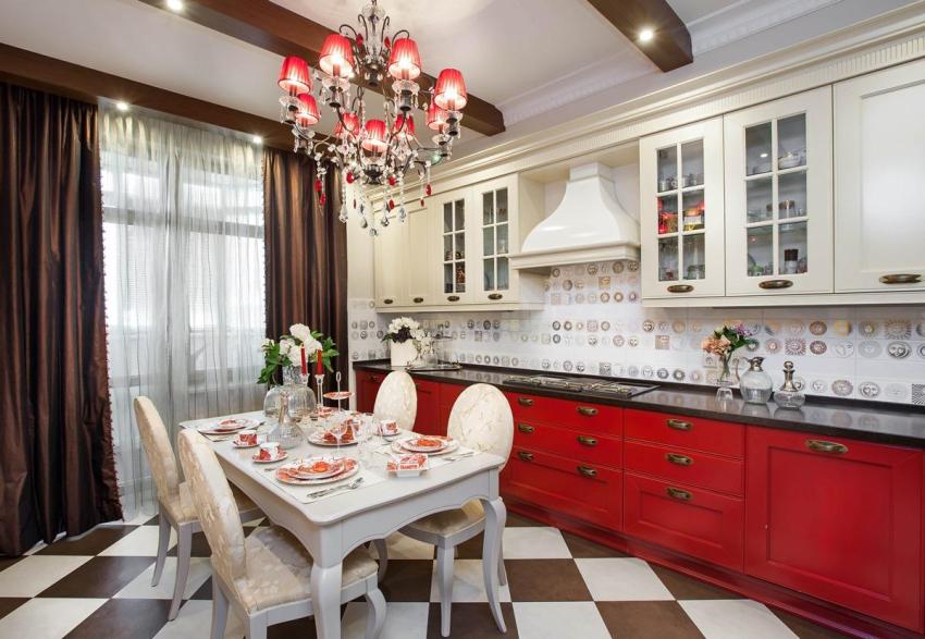
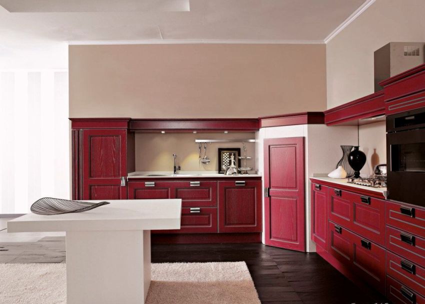
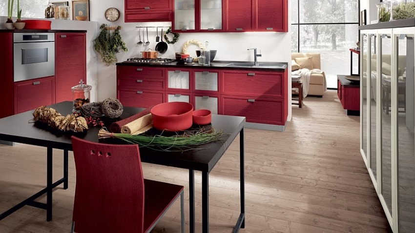
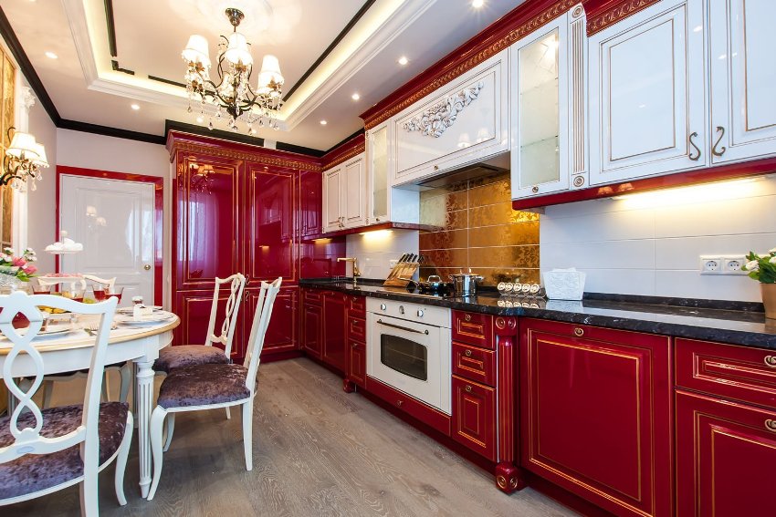
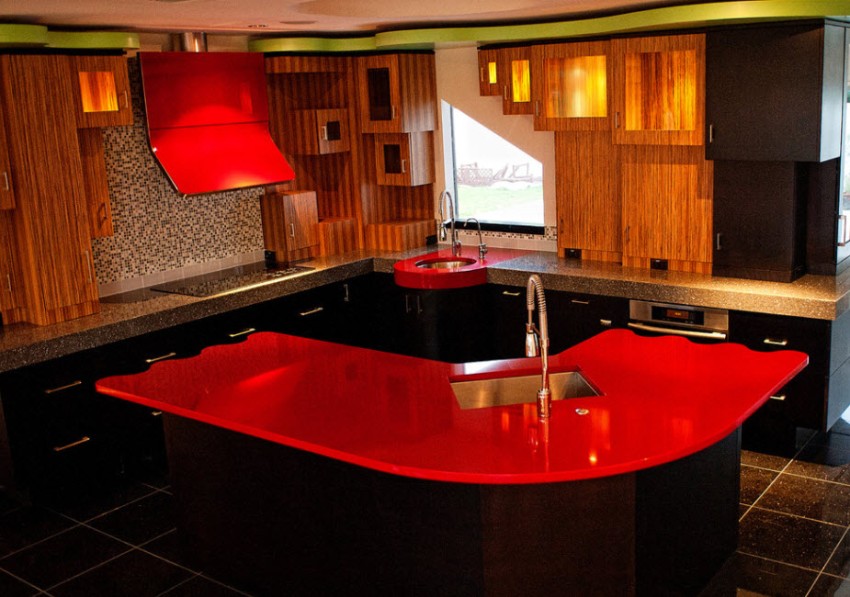
Burgundy is considered to be a luxurious color that is popular among designers, especially when it comes to kitchen decoration. The burgundy color always looks rich and brings a festive touch to the atmosphere of the kitchen, but this requires competently combining various color accents.
Red is mainly chosen by eccentric people, because its abundance creates a powerful energy in the kitchen, which in a peculiar way affects different people. If you mix red with brown, you get a burgundy hue that is both bright and cozy, and not as harsh as red. Other reasons contributing to the choice of burgundy color for the kitchen:
- burgundy is a color that always remains in fashion. Luxurious burgundy kitchens look rich, especially since in this tone you can decorate a kitchen in any style - from classics to modern popular trends. Even a Japanese-style kitchen is easy to accomplish using burgundy motifs;

Bordeaux kitchens are a great alternative to bright red kitchen designs
- burgundy shades evoke warm and homelike associations. Such a kitchen is filled with comfort and tranquility, it is pleasant to be on it;
- the possibility of using in small kitchens. In a small room, burgundy shades are recommended to be used to highlight spectacular details and to place color accents;
- practicality of the shade. Burgundy is considered a versatile color that can be combined with any popular shades in the interior. Even in combination with black, the burgundy kitchen looks laconic and restrained;

Burgundy cuisine looks great in both modern and traditional designs
- has a positive effect on increasing appetite. Therefore, if a person does not have problems with being overweight, then this color will be ideal for decorating a kitchen.
The main options for the competent design of the Bordeaux kitchen
If you look at photos of burgundy kitchens, you can pay attention to the fact that the interior, made using this color, looks interesting and is considered pleasing to the eye. Despite this, you should exercise restraint in the design of the room and adhere to the principle of moderation.
Useful advice! The kitchen, the interior of which is not striking, but evokes extremely positive emotions both among the owners of the house and among the guests, will look good. It is important to remember that using more than three bright colors in the kitchen will create a negative effect.
It is not difficult to make a kitchen in burgundy color; several successful methods have been developed for this. For example, it is appropriate to choose a kitchen set with cherry-colored facades, which is also considered a burgundy option. If you choose cherry for finishing horizontal surfaces, then in this case it is better to use more calm neutral shades for the rest of the interior.

Bordeaux is a versatile color that can be combined with any shade in the kitchen
The arrangement of bright details and accents, made in burgundy color, will make the kitchen elegant and, in a sense, even pompous, so the accessories should be chosen carefully. If you want to dilute the burgundy with other colors, then you need to take into account that some shades will make the interior not very attractive. It is not recommended to combine burgundy with such colors:
- Blue. In combination with it, burgundy looks dull and inexpressive.
- Green. Together with burgundy, it creates a complex combination for perception.
- Purple. Too cold and dark color, which will make the room gloomy.

The design of the kitchen in cherry color, which is also considered a shade of burgundy, will be successful.
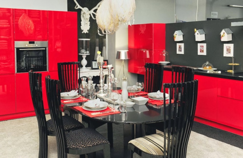
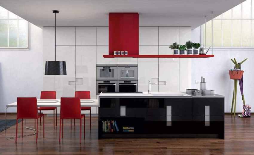
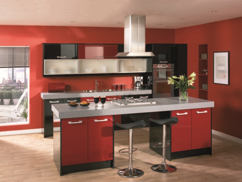
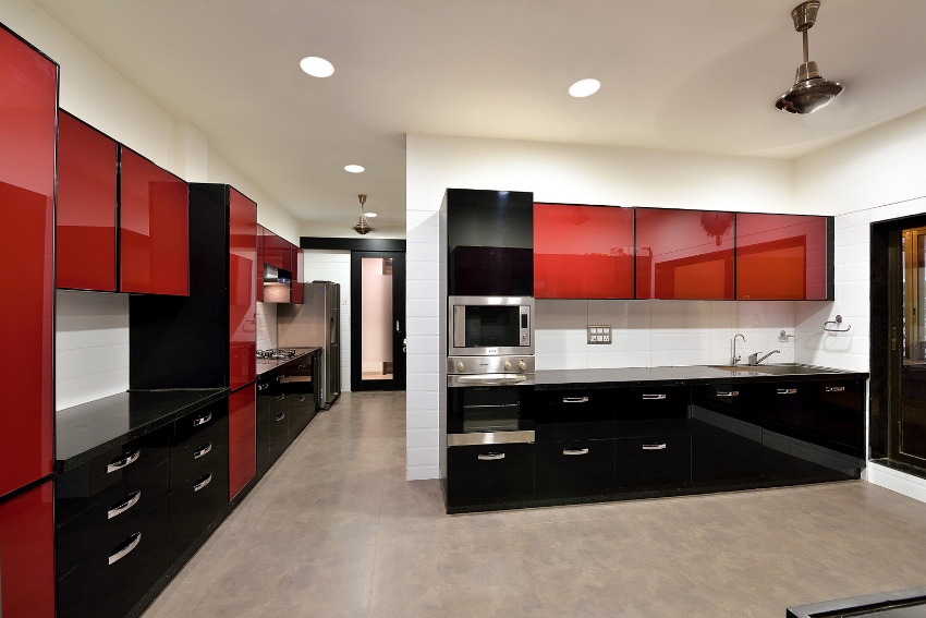
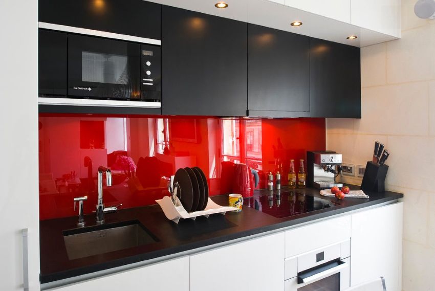
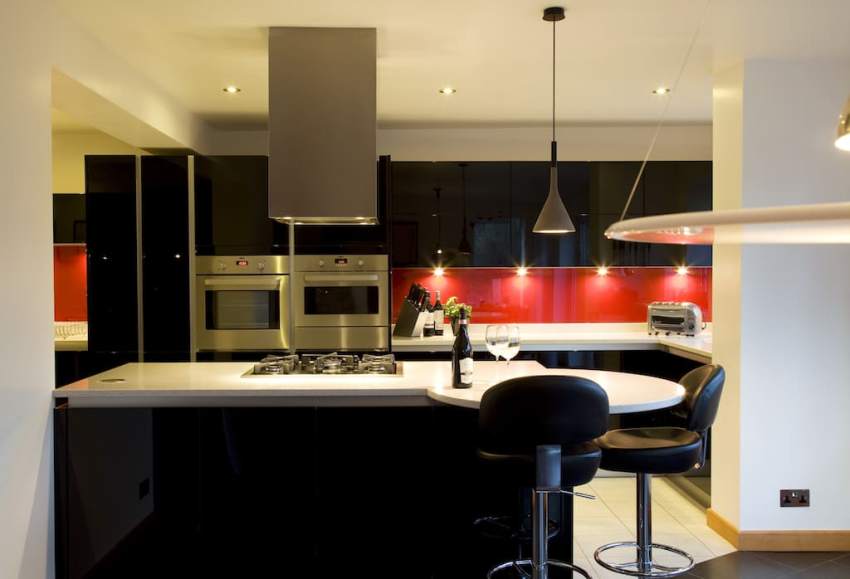
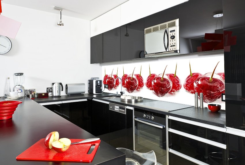
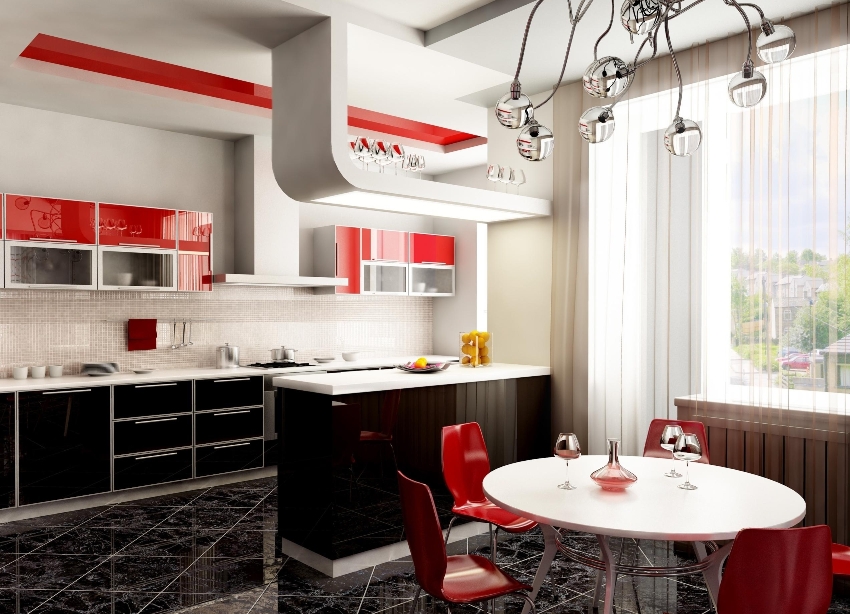
Extravagant red and black kitchen
Many people find the design of a red and black kitchen to be too catchy and defiant. Nevertheless, with the right combination of these colors, it will be possible to create not only an attractive, but also a cozy room. The contrasting use of black against a background of red is not recommended for closed people, so-called introverts, for whom such colors do not suit at all. The main advantages of a red-black kitchen:
- the combination belongs to the category of extravagant, so such a room will never look ordinary and boring;

- many want to decorate the kitchen in such bright colors, but not everyone has the courage to do this, so any guest can be surprised with such a room;
- a red and black kitchen will have a positive effect on a person's energy potential. In such a room, cooking takes less time, here you always want to conduct new experiments;
- red and black tandem is suitable for any interior.
Important! The design of a red and black kitchen is appropriate only for decorating the interior of a room of emotionally stable people, otherwise it will have a negative impact.

Red combined with black in kitchen design is one of the current trends of recent times
To make the kitchen design less expressive, it is recommended to replace the red color with burgundy, cherry or crimson, which are considered calmer. These shades are suitable for classic interior decoration. If you want to create a more modern design, then you can replace the red with a softer shade; for this purpose, raspberry or fuchsia is suitable.
As for the use of a red and black headset, it is appropriate to dilute such a palette with the help of mirror surfaces, and you can also add a marble texture. A good design option for a corner red-black kitchen is a combination of a black bottom and a red top. The chess combination in furniture arrangement also looks beautiful. A red corner kitchen can be made more original with glossy fronts that reflect black interior elements.

Black color in the kitchen promotes concentration of attention during cooking and eating
Features of the design of the white-red and red-gray kitchen
You can often find in the photo designs of white and red kitchens. This option is considered the most classic combination and visually enlarges the room. The main rule in the design of such a kitchen is not to perform sharp contrasts and give preference to cream and beige shades.
White can be diversified by applying different colors of the facades of household appliances. For example, electrical appliances with metallic silver housings fit well into such an interior. It should also be borne in mind that a white and red kitchen looks different depending on the intensity of the lighting and the size of the room. So, if the kitchen is dark, then it is better to use more white, and in a light kitchen, shades of coral look advantageous.

The use of pure gray in the interior of a red kitchen is considered too hackneyed. It is for this reason that it is advised to use a bolder combination and give preference to gray with a bluish tint, and it is better to replace pure red with raspberry. It is appropriate to dilute such a gray-red interior with yellow and orange accents.
It should be borne in mind that gray tones can be different - this is light gray, ash, graphite and the color of concrete. All these shades should be used to diversify the interior. In such a kitchen, a red set will look beautiful, on which beautiful chrome fittings will be installed. As for the color of the furniture, it is also good to adhere to the rule that the bottom is made in dark red and the top is made lighter.

It is desirable to combine soft reds with gray and white.
Not everyone has the courage to paint a room in red, but not everyone should use this color for interior decoration. For those with an active lifestyle, the red kitchen will serve as a bright corner, especially if neutral shades are used in other rooms. In a kitchen where all the elements are chosen correctly and restraint in the choice of colors is observed, you can create an interior that will delight the eye for a long time.