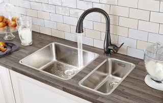
There is no color that cannot be used to create a kitchen interior. Before choosing, you need to understand that the chosen color of the kitchens will affect not only the mood of the household, but also gastronomic preferences. A kitchen decorated in warm colors improves appetite, while using cold colors, on the contrary, reduces interest in food. Each color influences feelings, reactions and sensations in its own way.

Any color you like can be correctly used in the interior of the kitchen
Content
- 1 How to choose a kitchen color: a combination of colors depending on the characteristics of the room
- 2 How to choose a kitchen color: photos of beautiful and pleasant interiors
- 3 What color of the kitchen to choose depending on the walls and ceiling
- 4 How to determine the color of the kitchen facade: popular shades and their meaning
- 5 Red and white kitchen: a bright idea for a stylish design
- 6 How to make a space inviting with a brown kitchen
- 7 Brown and white kitchen: how to correctly combine colors
- 8 Various design options for green kitchens
- 9 Good examples of kitchen design in gray
- 10 Classic white kitchens: advantages and disadvantages
- 11 Features of choice: light kitchens with dark countertops and vice versa
How to choose a kitchen color: a combination of colors depending on the characteristics of the room
The combination of colors in the kitchen is considered an important point in the design. Before deciding what color to make the kitchen, it is important to consider the basic rule: to create a harmonious and cozy style, you should not use more than five different colors, the use of three shades is considered optimal. At the same time, 60% of the space is done in one color, 30% in the secondary color and 10% remains in the third shade, which is used to create bright accents. Typically, more catchy tones are used to highlight small but important interior details.

Kitchens can be contrasting, solid or mixed shades
Useful advice! To prevent large objects from appearing too bulky, it is recommended to choose subdued and soft shades for them.
Before choosing the color of the kitchen unit, you need to additionally take into account the size of the room and the general concept of the room. The entire interior should not be performed in one color, because a monotonous room will quickly get bored, as a result of which you will have to update the appearance of the kitchen after a short time.By the type of color combination, kitchens are divided into 3 main types:
- plain;
- mixed;
- contrasting.
If you want to make the kitchen monochromatic, then it is advised to choose one color you like and use several of its different shades. This will create the perfect kitchen, where it will be pleasant to be, and one that will not quickly get bored.

The color for the kitchen is selected taking into account the dimensions of the room and the general concept
Contrasting shades are used to create bright and elegant interiors. They are suitable both for decorating a separate kitchen and for arranging combined premises, which include a kitchen, dining room and living room.
With a mixed version, it is required to use the purest and brightest tone as the main color, and use a calmer and more discreet tone as a tint.
Before deciding what color the kitchen should be, you need to understand that excessive enthusiasm for bright colors will make the room too colorful and annoying. When thinking about which kitchen to choose, you should also take into account the side of the world where the kitchen windows face. For example, if the windows face south, it is appropriate to apply cool shades such as blue, turquoise or light blue. It is better to decorate a kitchen with a north orientation in warm colors, choosing the following colors:

Using no more than three colors in one kitchen is considered the most optimal solution.
- beige;
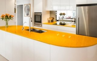
- yellow and lemon;
- red;
- shades of brown;
- green.
How to choose a kitchen color: photos of beautiful and pleasant interiors
Kitchens created using different shades allow you to create a certain mood in the room. In this case, every moment is important: the brightness in the room, the saturation of the surface finish, the choice of the color of the facades. To decide what color to choose a kitchen, you need to take into account the following designer tips:

Light shades will make any room visually more spacious
- If you use light shades to decorate the walls and facades of the kitchen unit, you can visually make the room a little larger, which is especially important when arranging a small kitchen.
- Using dark tones reduces space, so it is better to leave dark tones for spacious rooms.
- In the event that you want to lose weight, gray and pink will be the best colors for the kitchen. These shades help control your appetite.
- There are colors that, on the contrary, improve appetite, this includes a warm shade of red, orange, brown. It is especially important to use such tones for families with children who do not eat well.
- A kitchen is considered comfortable if the colors of the kitchen set correspond to natural tones, especially if the facades are made of natural material.
- If the kitchen is large and at the same time combined with the dining room or living room, then the white color of the facades can be lost in such space. In this case, it is recommended to add eye-catching elements, for example, stained glass inserts on the facades or bright household appliances.
- Before deciding what colors to paint the kitchen with, you must first choose the shade of the headset you like, and the surfaces should be in harmony with each other.

Natural shades in the interior of the kitchen have a beneficial effect on residents
What color of the kitchen to choose depending on the walls and ceiling
When arranging a kitchen, there is no need to try to make all surfaces in one color palette. Correctly and harmoniously, you can arrange a room using both contrasting colors and completely dissimilar shades. For example, it is recommended to combine blue and yellow colors in the kitchen interior, which enhance the brightness of each other. Another organic option is the combination of red and purple, which smoothly flow into each other, creating successful compositions.
The harmonious combination of various shades allows you to set a certain rhythm to the room, add dynamics to it, emphasize the advantages and correctly place accents. Therefore, when choosing the color of the kitchen unit, you need to take into account the general concept of room decoration, paying attention to the decoration of the walls and ceiling. It will be useful to seek help from a designer, but if you do not want to do this, then you should take into account the following nuances:

A kitchen in which the color of the headset contrasts with the floor and ceilings looks quite impressive
- When choosing a headset color, you need to choose the right artificial lighting, especially if there is a lack of natural light. In any case, it must be taken into account that, no matter how bright the natural light is, the transition from light to shadow changes during the day, so artificial lighting comes to the fore.
- To create a complete picture of the kitchen, you should resort to a combination of different shades. For example, light yellow-green wallpaper will make the blue-green facade of the kitchen unit look more attractive.
- In order not to be afraid to combine different shades, it is recommended to use a color wheel, which allows you to correctly select contrasts. For example, studying the photo of gray kitchens, you can see that the countertop looks harmoniously in the interior to match the flooring.

The color of the headset can be consonant with the shade of the floor and ceiling
How to determine the color of the kitchen facade: popular shades and their meaning
Kitchen furniture is purchased for more than one year, therefore, the choice of the color of the facades must be approached carefully. It is preliminarily recommended to study photos of designs of colored kitchens and dwell on several of the most attractive options, so that there is plenty to choose from. When deciding on a color scheme, you need to take into account certain properties of various shades. For example, some facades may look attractive in a picture, but in real life they will look ridiculous and inappropriate.
When choosing facades, it is necessary to strive to correctly combine shades of warm and cold tones. If the balance is maintained, then it will be comfortable to be in the kitchen and cook. If the colors do not match the character, then prolonged stay in the room can cause irritation and anxiety. For example, a champagne kitchen creates a feeling of warmth and tenderness, while an abundance of gray can cause a depressive and apathetic mood. A brief description of the properties of other colors:

Kitchen facades in purple shades will be liked by active and cheerful people
- Red. A color that makes you want to move and be active. However, the abundance of red, especially its bright shades, will be annoying.
- Orange. The color of warmth, bliss, good mood. Has a positive effect on the energy of the room.
- Bordeaux. A softer version of red, the abundance of which does not make the interior so passionate and aggressive.
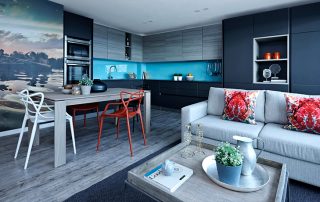
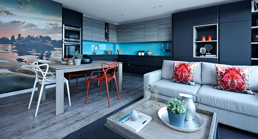
- Blue. The color of reliability and coolness. Warmer shades of blue evoke associations with the sea.
- Blue. A color that promotes positive emotions. Blue kitchens are most characteristic of the Provence style.
- Turquoise. Refers to bright, but unobtrusive colors, associated with serenity and tranquility. A turquoise kitchen will refresh and cool a room that faces south.
- Yellow. The positive color of happiness and sun. A kitchen with such facades is considered more hospitable.
- Green. The color of nature and abundance, which is associated with something new.
- Pink. Soft color that prevents increased appetite.
- White. Clean and measured color. It is used in combination with most shades.
- The black. A mysterious color, the abundance of which can cause mood decay, therefore it is often combined with more cheerful tones.
- Gold. The color of prestige and wealth. Suitable for baroque or classic rooms.

Blue, turquoise and green are good for different styles.
Red and white kitchen: a bright idea for a stylish design
A bright interior with shades of red will definitely have a positive effect on the mood of others. He is able to cheer up in the morning, always looks festive and elegant. Red kitchen is considered a good solution for courageous people who do not want to live in a boring and ordinary room. This color inspires activity and develops the desire to learn new things.
Related article:
The combination of colors in the interior of the kitchen: we create a stylish and harmonious space
How to harmoniously combine shades in a room. Choice of color for walls, cabinet fronts, furniture and accessories. Examples of well-designed kitchens.
The main advantages of using a red and white kitchen set:
- such a design looks beautiful in the kitchen, will delight the owners for a long time;
- has a positive effect on vitality;
- cheers up;
- makes it possible to combine surfaces of different texture;
- adjusts the configuration of the kitchen, especially if white will be used as the main color.

Red and white kitchens improve mood, vitality and appetite
Useful advice! If a person suffers from chronic hypertension, red should be abandoned, because the color provokes pressure surges upward.
The main condition for organizing a kitchen interior is to choose the right color combination. If you look at photos of red and white kitchens, then you should pay attention that the more spacious the room, the more red can be used in it. In a smaller room, preference should be given to a white headset with several red front doors.
How to make a space inviting with a brown kitchen
Despite the emergence of new styles and trends in the design of the kitchen, brown is still considered one of the most popular. Natural wood is considered a classic material for brown facades. If you need to save on repairs, then for this purpose, facades made of MDF or chipboard, which beautifully imitate the natural texture, are quite suitable. At the same time, if you choose artificial materials for the manufacture of facades, then you can give preference to various shades of brown - from coffee to the color of milk chocolate.

Brown is the most versatile color as it suits classic and modern interiors
Brown is a universal color, it can be combined with many shades and used in the design of various interiors. Such facades can be glossy or matte, monochromatic or combined with other shades. Artificially aged brown facades with a paneled pattern or carving look beautiful.
Useful advice! A beige kitchen should contain a large number of small interior details associated with coffee and chocolate.
It is important to supplement the facades with glass inserts, stained-glass windows and unusual fittings. The main advantages of using brown in the kitchen:

Brown kitchens look neutral, so they don't attract too much attention and don't get bored.
- Versatility. Brown is suitable for people of all ages and will look good both in a classic kitchen and in a modern style room.
- Practicality. A brown kitchen set is considered non-staining and easy to care for.
- A variety of shades. Beige-brown, caramel, nut, coffee, chestnut or wenge-colored kitchens are all considered variations of brown.
- Combination. Brown is a neutral color that does not attract undue attention, so it can be used to create a harmonious ensemble in the kitchen.
- Positivity.The color has a relaxing effect on the nervous system, soothes. In such a kitchen, it is pleasant to relax and get away from the everyday bustle.
Brown and white kitchen: how to correctly combine colors
Even if the kitchen is small, and the budget for creating the interior is limited, then the use of a combination of white and brown will help fill the room with coziness, make it refined and stylish. If the room is large, you can choose shades of brown, down to the darkest. White is best used as a complementary tone. The photo of white-brown kitchens shows that in a small area it is better to use white for facades, which will look especially advantageous against the background of brown walls.

The combination of white and brown is suitable for both small and large rooms
When designing a white-brown kitchen, it is quite acceptable to use inexpensive materials for the manufacture of facades, the main thing is that they correctly imitate a wooden texture. A properly organized kitchen in white and brown colors looks like this:
- the floor and work surface are made using brown;
- furniture and household appliances - white shades;
- textiles and accessories - light and dark brown;
- the ceiling and walls are white.
If brown is used as the primary color, then abundant lighting will be needed. At the same time, it is better to choose warm light, especially if it is a kitchen in beige colors, which looks dirty in bright light. To liven up and make the interior more interesting, it is advised to place green plants in the kitchen.
Various design options for green kitchens
Only a kitchen in green color is able to endow with cheerfulness, tone up and cheer up. It is green that is considered the most common natural shade of the entire color palette. Moreover, the color stimulates mental activity well. The green headset is considered to be very popular with consumers. When combined with other shades, a lively and unobtrusive interior is obtained, which has a beneficial effect on a person's mood.

Green kitchens look juicy and bright, add cheerfulness and cheer up their owners
Green has a large number of shades - this is light green, lime color, pistachio and even olive. The use of such tones adds freshness to the room and charges with positive energy. If you choose a cold shade of green and make the kitchen light green, then on the facades, in addition to the main color, you can use inserts of white, brown and gray tones. Warm green pairs well with beige, yellow and coffee colors.
Green in the interior of the kitchen can be used both as the main and auxiliary color, choosing beautiful accessories of the same shade. It is recommended to complement a green set with an emerald-colored kitchen apron, a light green chandelier or textiles in the same colors. Live plants in pots will complete the interior.
The main advantages of decorating a white-green kitchen
The combination of white and green gives the space a special elegance, but to achieve this, you need to competently combine and combine shades. Choosing different tones of green will help you create unique combinations that suit any mood, such as:

White kitchen with the addition of an emerald shade will look incredibly elegant
- the use of predominantly pistachio color will fill the kitchen with coziness;
- emerald is considered an essential attribute of a luxurious room;
- a shade of lime will perfectly emphasize the modern style of interior decoration.
White belongs to the classic and versatile colors, can be easily combined with any other shades. In addition, it is used to visually increase the space. At the same time, the green color brings a touch of freshness and joy.The combination of white and green tones is optimal for use in rooms of any size. However, if in a large kitchen it is permissible to use shades of dark green, then in a small kitchen it is better to use brighter colors.
Before choosing a white and green color scheme for a headset, you need to take into account that such surfaces will quickly get dirty. Therefore, materials should be chosen that are resistant to friction, high quality, and easy to clean. Another important point is the fact that white and bright green are distinguished by their ability to reflect light well, which can cause excessive light in the room.

In a kitchen with a white finish, any shade of green looks bright and impressive
When choosing the color of the headset, you need to take into account the orientation of the kitchen relative to the cardinal direction: if the side is north, warm shades of green are suitable, for the south, it is better to prefer a dark green spectrum. If you look at photos of white-green kitchens, then you can highlight the following ideas for combining colors:
- white facades and green apron;
- green ceramic tiles against the background of snow-white facades;
- a combination of white at the top of the kitchen and green at the bottom;
- Ceramic tiles featuring green grass or fruit on a white background make a great transition between a white bottom and a green top of a kitchen unit.
Useful advice! On a white background, any shade of green will look impressive. The richer the base shade, the more white is recommended.
What a pistachio kitchen should look like
If you look at photos of pistachio-colored kitchens, you can immediately see that the abundance of this shade makes the kitchen light, light and airy. It is thanks to these properties that the color has gained such popularity among designers. Another advantage is considered to be the ability of pistachio to blend with most colors and match many interior styles, from classic to high-tech.

Pistachio color will make the kitchen room more airy, light and light
It is interesting! The pistachio color is considered the result of a mixture of yellow and green tones.
Despite the fact that pistachio is combined with many shades, you should not combine too bright colors with it, and you should also not complement the kitchen with a large number of decorative elements. In addition to the kitchen set, the dining group also looks good in this color. Psychologists note that the presence of pistachio in the interior of the kitchen can relax a tired person. However, you should not think about a monochrome pistachio interior, because the result will be a too pale room. It is good to combine pistachio with these colors:
- Brown. A kitchen in brown and pistachio shades is considered a classic option that looks cozy and sophisticated.
- Black. A modern kitchen interior decorated with these two shades looks catchy and unusual, especially if you choose glossy facades.
- Yellow and orange. Pistachio facades against the background of walls of such colors look positive and sunny. This option is suitable for small kitchens.

Pistachio pairs best with white, black and brown flowers
The pistachio set will look good with both glossy and aged patinated facades. A pistachio-colored set looks three-dimensional, so you need to take into account the shape and size of the room. The lighting built into the headset will add volume to the furniture.
Another shade of green, or olive green kitchen
Olive is considered to be a color that can relieve fatigue and help get rid of everyday problems. Like many other shades of green, olive increases sensitivity, adjusts for communication and relaxation, and has a positive effect on the nervous system.
The olive color palette consists of many shades - from very dark to very pale.This color range includes the following tones:

Olive color has an incredibly varied palette of shades
- moss;
- antique gold;
- khaki and military colors;
- golden brown;
- brownish green.
So that the olive-colored set does not overload the interior, it is recommended to install it against the background of white or milky walls, and a light ceiling will complement the interior. In the production of kitchen furniture, the most common are bright and delicate shades of khaki or a combination of light and deep colors.
If the option of the classic headset is chosen, then the facades are often monophonic, patinated. In a modern interior, it is appropriate to combine olive with gray, white, blue and beige, sometimes even a combination with black is found.

Kitchens with olive fronts look best against light walls and floors.
It is good when glass inserts or glossy facades with a pattern are found in the olive set. A metal-colored countertop, as well as a mosaic apron, will look beautiful in the space between the upper and lower cabinets. Under the olive set, you can choose a dining group to match or, conversely, in a contrasting color. The combination of a table with a glass top and olive chairs is considered successful.
Good examples of kitchen design in gray
Designers do not recommend using an exclusively gray color for a kitchen set, because it is considered boring and too cool, especially if the kitchen is poorly lit. If a gray color was chosen for the kitchen unit, you need to choose different textures, use transparent glass inserts and bright chrome fittings that reflect light well.
From the point of view of practicality, gray is considered a non-marking color, it retains its shade for a long time and does not fade. A gray kitchen set is considered an integral part of high-tech, minimalism, loft and art deco styles. It should be borne in mind that the palette of gray is varied: it can be either deep gray or pale, close to white. The most popular shades of gray are:

Gray is great for loft-style kitchens, minimalism, high-tech
- graphite;
- granite;
- concrete;
- pebbles;
- nacre;
- silver metallic;
- vanilla.
Gray facades look good in glossy and matte versions. Such headsets can be supplemented with carvings and textured elements. Appliances made in silver shades of gray will perfectly fit into a kitchen decorated in this way. A good combination is the presence of light gray upper cabinets and darker lower cabinets. A light countertop and a white apron will look good between them.
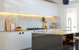
Classic white kitchens: advantages and disadvantages
White or white and beige cuisine has always been considered classic. She looks fresh and tidy, especially if she is constantly updated with bright décor and textiles that make the kitchen look different every time. White has always been considered the most popular color, especially for decorating a small kitchen, since a white set does not load the space, but makes it visually larger. If you refresh the white set with glass inserts, then it seems to "dissolve" in the room and visually enlarge the room.

White is considered the classic and most sought-after color.
White has gained popularity among designers, because the white set, depending on the selected texture or texture, can be used to decorate any interior style - from classic to ultra-modern.
The main disadvantage of a white kitchen is its soiled. This is especially true for a glossy white kitchen in the interior, on which fingerprints and greasy stains remain. Therefore, you should take care of this furniture carefully, and it is also necessary to select better materials for such a headset.
It is interesting! Black color, in comparison with white, is considered more easily soiled, any dirt is clearly visible on it.

White shades will look good in a variety of kitchen styles
Looking at the photo of kitchens in white, you can pay attention to the fact that the excessive fascination with white makes the room look like a hospital room. Therefore, when choosing a white set, you should know that the countertop and walls should be darker.
White kitchen set: decoration of the surrounding space
In the interior of the kitchen in white tones, you need to correctly combine the colors so as not to get a monochrome and boring space. The generally accepted rule of thumb is that white kitchen furniture goes well with any wall color. If the kitchen is decorated in a modern style, then the white furniture will perfectly harmonize with the collage on the walls, painted with graffiti or photo wallpaper. Effective 3D wallpaper can be used on one wall as an accent element in a white kitchen. Other rules for decorating the kitchen interior in white:

Chrome fittings look good on white kitchen sets
- Small drawing on the walls, monochrome or with bright lines patterns will add mood to the kitchen and dilute the interior.
- Curtains in warm colors will make the room softer, while the cool shade of textiles will slightly "cool" the room. It is better if the curtains match the tone of the headset, but in this case the walls should be darker.
- A white kitchen window can be made the center of attention by choosing curtains with bright stripes on a milky background.
- It is appropriate to combine a white kitchen with green curtains against a light green wall. In this case, it is recommended to replace the upper cabinets of the white headset with open shelves.
- You can dilute the white interior with decor, for example, using different kitchen towels and potholders, tablecloths, flowers in beautiful pots.
- The presence of mosaics on the facade will make the interior more lively.
- Glass, chrome or silver handles are suitable as accessories.
- A good option is a combination of a white kitchen with a dark countertop with a stone texture.

The table top and apron with a stone pattern are a stylish addition to the white headset
How to choose the right dining group with a white table in the kitchen
White furniture is suitable for any interior style. Depending on the design, they choose facades made of different materials, complemented by various inserts. Most classic styles include furniture made from natural wood or solid wood. A large white wooden table, set in the center of the dining room, will become a striking element in any home. If the budget for the purchase of kitchen furniture is limited, then you can choose a MDF table (the material is made on the basis of wood and is durable and attractive in appearance).
Useful advice! The snow-white dining group will become an interior decoration, especially if it is complemented by metal and glass inserts.
It should be borne in mind that the use of metal or chrome-plated parts is not recommended for the design of classic kitchens. Such inserts are appropriate for modern styles such as hi-tech, loft, minimalism. For classic interiors, a white table complete with chairs in light covers is suitable.

A dining group with a white table will decorate any kitchen
In general, white furniture is always considered a good option in the kitchen, due to which, in addition to the visual expansion of the area, an atmosphere of comfort is created. A table and chairs in white and milky colors will add lightness and elegance to the interior. A light kitchen set always looks neat and airy.
White and blue kitchen: light and airy colors to create a harmonious interior
Psychologists note that the use of blue in the interior has a relaxing and calming effect, and has a positive effect on lowering pressure. However, if you use too dark blue in your kitchen design, or, conversely, too saturated, then such shades can suppress appetite and act the opposite.
Blue and white cuisine is considered a classic combination. In this case, dark blue and white surfaces are used. The combination of white and blue can be used to create both classic and ultramodern interiors. If modern styles tend to use glossy facades, then matte surfaces are more typical for classics.

White and blue kitchens look great in both matte and glossy versions
The kitchen, where a snow-white kitchen set is installed, will look attractive, and a blue-gray color is used for finishing the apron, which is also used to decorate the dining group, open shelves and flooring. The interior is complemented by snow-white light curtains on the windows.
The combination of white furniture and a blue apron is often used to create Mediterranean and Scandinavian interiors, for Provence and Empire styles. Studying the photos of white and blue kitchens, you can notice that the ceiling is often made in white or white and blue (like an imitation of the sky with clouds). Orange decor items will be an interesting addition to the kitchen.
Features of choice: light kitchens with dark countertops and vice versa
When choosing a countertop, you need to take into account that it should be combined with a facade and an apron. To do this, even at the stage of buying kitchen furniture, samples of countertops should be applied to the selected facades. The most popular are white, black, beige stone and wood countertops. Common combination options:

Light kitchen worktop will dilute and complement the dark set
- White headset. A neutral countertop color will work. A white kitchen with a dark countertop looks beautiful in the photo. A cold stone color is preferable - black or gray.
- Beige headset. It is recommended to combine a beige kitchen with a dark countertop, which will make the creamy shade of the cabinets even more subtle.
- Dark or black headset. You should not buy completely black kitchen cabinets - a black and white kitchen looks beautiful, where the lower cabinets are made in black and the upper ones in white. On the Internet, you can find many photos of black kitchens with white countertops.

A dark countertop in a light or bright kitchen looks stylish and non-standard
It is interesting! The lighter the shade of the countertop, the larger it appears. In order not to overload the space, it is not recommended to install a too light countertop in a small kitchen.
Before you finally decide on the color of the kitchen and kitchen set, you need to study various options for combining shades. Choosing the right color should be based not only on personal preferences, but also taking into account the size of the room, lighting features and interior design.